[R-bloggers] Base Rate Fallacy – or why No One is justified to believe that Jesus rose (and 6 more aRticles)
[R-bloggers] Base Rate Fallacy – or why No One is justified to believe that Jesus rose (and 6 more aRticles) |  |
- Base Rate Fallacy – or why No One is justified to believe that Jesus rose
- Applying gradient descent – primer / refresher
- Common Uncommon Notations that Confuse New R Coders
- A Comparative Review of the JASP Statistical Software
- RStudio Package Manager 1.0.8 – System Requirements
- When Standards Go Wild – Software Review for a Manuscript
- Explore the landscape of R packages for automated data exploration
| Base Rate Fallacy – or why No One is justified to believe that Jesus rose Posted: 18 Apr 2019 03:00 AM PDT (This article was first published on R-Bloggers – Learning Machines, and kindly contributed to R-bloggers)
The reason for this is that the disease itself is so rare that even with a very sensitive test the result is most probably false positive: it shows that you have the disease yet this result is false, you are healthy. The key to understanding this result is to understand the difference between two conditional probabilities: the probability that you have a positive test result when you are sick and the probability that you are sick in case you got a positive test result – you are interested in the last (am I really sick?) but you only know the first. Now for some notation (the vertical dash means "under the condition that", P stands for probability):
To calculate one conditional probability from the other we use the famous Bayes' theorem: In the following example we assume a disease with an infection rate of 1 in 1000 and a test to detect this disease with a sensitivity of 99%. Have a look at the following code which illustrates the situation with Euler diagrams, first the big picture, then a zoomed-in version: library(eulerr) A <- 0.001 # prevalence of disease BlA <- 0.99 # sensitivity of test B <- A * BlA + (1 - A) * (1 - BlA) # positive test (specificity same as sensitivity) AnB <- BlA * A AlB <- BlA * A / B # Bayes's theorem #AnB / B # Bayes's theorem in different form C <- 1 # the whole population main <- paste0("P(B|A) = ", round(BlA, 2), ", but P(A|B) = ", round(AlB, 2)) set.seed(123) fit1 <- euler(c("A" = A, "B" = B, "C" = C, "A&B" = AnB, "A&C" = A, "B&C" = B, "A&B&C" = AnB), input = "union") plot(fit1, main = main, fill = c("red", "green", "gray90"))
fit2 <- euler(c("A" = A, "B" = B, "A&B" = AnB), input = "union") plot(fit2, main = main, fill = c("red", "green"))
As you can see although this test is very sensitive when you get a positive test result the probability of you being infected is only 9%! In the diagrams C is the whole population and A are the infected individuals. B shows the people with a positive test result and you can see in the second diagram that almost all of the infected A are also part of B (the brown area = true positive), but still most ob B are outside of A (the green area), so although they are not infected they have a positive test result! They are false positive. The red area shows the people that are infected (A) but get a negative test result, stating that they are healthy. This is called false negative. The grey area shows the people who are healthy and get a negative test result, they are true negative.
Due to the occasion we are now coming to an even more extreme example: did Jesus rise from the dead? It is inspired by the very good essay "A drop in the sea": Don't believe in miracles until you've done the math. Let us assume that we had very, very reliable witnesses (as a side note what is strange though is that the gospels cannot even agree on how many men or angels appeared at the tomb: it is one angel in Matthew, a young man in Mark, two men in Luke and two angels in John… but anyway), yet the big problem is that not many people so far have been able to defy death. I have only heard of two cases: supposedly the King of Kings (Jesus) but also of course the King himself (Elvis!), whereby sightings of Elvis after his death are much more numerous than of Jesus (just saying… Have a look at the following code (source for the number of people who have ever lived: WolframAlpha) A <- 2/108500000000 # probability of coming back from the dead (The King = Elvis and the King of Kings = Jesus) BlA <- 0.9999999 # sensitivity of test -> very, very reliable witnesses (many more in case of Elvis
fit2 <- euler(c("A" = A, "B" = B, "A&B" = AnB), input = "union") plot(fit2, main = main, fill = c("red", "green"))
So, in this case C is the unfortunate group of people who have to go for good… it is us.
Or in the words of the above mentioned essay:
But this chimes well with a famous Christian saying "I believe because it is absurd" (or in Latin "Credo quia absurdum") – you can find out more about that in another highly interesting essay: 'I believe because it is absurd': Christianity's first meme Unfortunately this devastating conclusion is also true in the case of Elvis…
To leave a comment for the author, please follow the link and comment on their blog: R-Bloggers – Learning Machines. R-bloggers.com offers daily e-mail updates about R news and tutorials on topics such as: Data science, Big Data, R jobs, visualization (ggplot2, Boxplots, maps, animation), programming (RStudio, Sweave, LaTeX, SQL, Eclipse, git, hadoop, Web Scraping) statistics (regression, PCA, time series, trading) and more... This posting includes an audio/video/photo media file: Download Now | |||||||||||||||||||||||||||||||||||||||||||||||||||
| Applying gradient descent – primer / refresher Posted: 18 Apr 2019 02:50 AM PDT (This article was first published on R – Daniel Oehm | Gradient Descending, and kindly contributed to R-bloggers)
Every so often a problem arises where it's appropriate to use gradient descent, and it's fun (and / or easier) to apply it manually. Recently I've applied it optimising a basic recommender system to 'unsuppressing' suppressed tabular data. I thought I'd do a series of posts about how I've used gradient descent, but figured it was worth while starting with the basics as a primer / refresher. Linear regressionTo understand how this works gradient descent is applied we'll use the classic example, linear regression. A simple linear regression model is of the form where The objective is to find the parameters This is a good problem since we know the analytical solution and can check our results. In practice you would never use gradient descent to solve a regression problem, but it is useful for learning the concepts. Example dataSet up library(ggplot2) set.seed(241) nobs <- 250 b0 <- 4 b1 <- 2 # simulate data x <- rnorm(nobs) y <- b0 + b1*x + rnorm(nobs, 0, 0.5) df <- data.frame(x, y) # plot data g1 <- ggplot(df, aes(x = x, y = y)) + geom_point(size = 2) + theme_minimal() The analytical solution is given by # set model matrix X <- model.matrix(y ~ x, data = df) beta <- solve(t(X) %*% X) %*% t(X) %*% y beta ## [,1] ## (Intercept) 4.009283 ## x 2.016444 And just to convince ourselves this is correct # linear model formulation lm1 <- lm(y ~ x, data = df) coef(lm1) ## (Intercept) x ## 4.009283 2.016444 g1 + geom_abline(slope = coef(lm1)[2], intercept = coef(lm1)[1], col = "darkmagenta", size = 1)
Gradient descentThe objective is to achieve the same result using gradient descent. It works by updating the parameters with each iteration in the direction of negative gradient to minimise the mean squared error i.e. where The learning rate is to ensure we don't jump too far with each iteration and rather some proportion of the gradient, otherwise we could end up overshooting the minimum and taking much longer to converge or not find the optimal solution at all. Applying this to the problem above, we'll initialise our values for # gradient descent function gradientDescent <- function(formula, data, par.init, loss.fun, lr, iters){ formula <- as.formula(formula) X <- model.matrix(formula, data = data) y <- data[,all.vars(formula)[1]] par <- loss <- matrix(NA, nrow = iters+1, ncol = 2) par[1,] <- par.init for(k in 1:iters){ loss[k,] <- loss.fun(X=X, y=y, par=par[k,]) par[k+1,] <- par[k,] - lr*loss[k,] } return(list(par = par)) } # loss function loss.fun <- function(X, y, par) return(-2/nrow(X)*(t(X) %*% (y - X %*% par))) # gradient descent. not much to it really beta <- gradientDescent(y ~ x, data = df, par.init = c(1, 1), loss.fun = loss.fun, lr = 0.01, iters = 1000)$par # plotting results z <- seq(1, 1001, 10) g1 + geom_abline(slope = beta[z,2], intercept = beta[z,1], col = "darkmagenta", alpha = 0.2, size = 1)
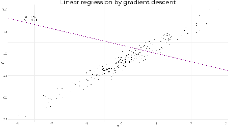
tail(beta, 1) ## [,1] [,2] ## [1001,] 4.009283 2.016444 As expected we obtain the same result. The lines show the gradient and how the parameters converge to the optimal values. A less reasonable set of starting values still converges quickly to the optimal solution showing how well graident descent works on linear regression. beta <- gradientDescent(y ~ x, data = df, par.init = c(6, -1), loss.fun = loss.fun, lr = 0.01, iters = 1000)$par # plotting results z <- seq(1, 1001, 10) beta.df <- data.frame(b0 = beta[z,1], b1 = beta[z,2]) g1 + geom_abline(data = beta.df, mapping = aes(slope = b1, intercept = b0), col = "darkmagenta", alpha = 0.2, size = 1)
tail(beta, 1) ## [,1] [,2] ## [1001,] 4.009283 2.016444 ggif_minimal <- df %>% ggplot(aes(x = x, y = y)) + geom_point(size = 2) + theme_minimal() + geom_abline(data = beta.df, mapping = aes(slope = b1, intercept = b0), col = "darkmagenta", size = 1) + geom_text( data = data.frame(z, b0 = beta[z,1], b1 = beta[z,2]), mapping = aes( x = -2.8, y = 9, label = paste("b0 = ", round(b0, 2), "\nb1 = ", round(b1, 2))), hjust = 0, size = 6 ) + transition_reveal(z) + ease_aes("linear") + enter_appear() + exit_fade() animate(ggif_minimal, width = 1920, height = 1080, fps = 80) | |||||||||||||||||||||||||||||||||||||||||||||||||||
| Common Uncommon Notations that Confuse New R Coders Posted: 17 Apr 2019 08:53 PM PDT (This article was first published on R – William Doane, and kindly contributed to R-bloggers)
Here are a few of the more commonly used notations found in R code and documentation that confuse coders of any skill level who are new to R. unless you specify
To leave a comment for the author, please follow the link and comment on their blog: R – William Doane. R-bloggers.com offers daily e-mail updates about R news and tutorials on topics such as: Data science, Big Data, R jobs, visualization (ggplot2, Boxplots, maps, animation), programming (RStudio, Sweave, LaTeX, SQL, Eclipse, git, hadoop, Web Scraping) statistics (regression, PCA, time series, trading) and more... This posting includes an audio/video/photo media file: Download Now | |||||||||||||||||||||||||||||||||||||||||||||||||||
| A Comparative Review of the JASP Statistical Software Posted: 17 Apr 2019 05:12 PM PDT (This article was first published on R – r4stats.com, and kindly contributed to R-bloggers) IntroductionJASP is a free and open source statistics package that targets beginners looking to point-and-click their way through analyses. This article is one of a series of reviews which aim to help non-programmers choose the Graphical User Interface (GUI) for R, which best meets their needs. Most of these reviews also include cursory descriptions of the programming support that each GUI offers. JASP stands for Jeffreys' Amazing Statistics Program, a nod to the Bayesian statistician, Sir Harold Jeffreys. It is available for Windows, Mac, Linux, and there is even a cloud version. One of JASP's key features is its emphasis on Bayesian analysis. Most statistics software emphasizes a more traditional frequentist approach; JASP offers both. However, while JASP uses R to do some of its calculations, it does not currently show you the R code it uses, nor does it allow you to execute your own. The developers hope to add that to a future version. Some of JASP's calculations are done in C++, so getting that converted to R will be a necessary first step on that path. TerminologyThere are various definitions of user interface types, so here's how I'll be using these terms: GUI = Graphical User Interface using menus and dialog boxes to avoid having to type programming code. I do not include any assistance for programming in this definition. So, GUI users are people who prefer using a GUI to perform their analyses. They don't have the time or inclination to become good programmers. IDE = Integrated Development Environment which helps programmers write code. I do not include point-and-click style menus and dialog boxes when using this term. IDE users are people who prefer to write R code to perform their analyses. InstallationThe various user interfaces available for R differ quite a lot in how they're installed. Some, such as BlueSky Statistics, jamovi, and RKWard, install in a single step. Others install in multiple steps, such as R Commander (two steps), and Deducer (up to seven steps). Advanced computer users often don't appreciate how lost beginners can become while attempting even a simple installation. The HelpDesks at most universities are flooded with such calls at the beginning of each semester! JASP's single-step installation is extremely easy and includes its own copy of R. So if you already have a copy of R installed, you'll have two after installing JASP. That's a good idea though, as it guarantees compatibility with the version of R that it uses, plus a standard R installation by itself is harder than JASP's. Plug-in ModulesWhen choosing a GUI, one of the most fundamental questions is: what can it do for you? What the initial software installation of each GUI gets you is covered in the Graphics, Analysis, and Modeling sections of this series of articles. Regardless of what comes built-in, it's good to know how active the development community is. They contribute "plug-ins" which add new menus and dialog boxes to the GUI. This level of activity ranges from very low (RKWard, Deducer) to very high (R Commander). For JASP, plug-ins are called "modules" and they are found by clicking the "+" sign at the top of its main screen. That causes a new menu item to appear. However, unlike most other software, the menu additions are not saved when you exit JASP; you must add them every time you wish to use them. JASP's modules are currently included with the software's main download. However, future versions will store them in their own repository rather than on the Comprehensive R Archive Network (CRAN) where R and most of its packages are found. This makes locating and installing JASP modules especially easy. Currently there are only four add-on modules for JASP:
Three modules are currently in development: Machine Learning, Circular StartupSome user interfaces for R, such as BlueSky, jamovi, and Rkward, start by double-clicking on a single icon, which is great for people who prefer to not write code. Others, such as R commander and Deducer, have you start R, then load a package from your library, and then call a function to finally activate the GUI. That's more appropriate for people looking to learn R, as those are among the first tasks they'll have to learn anyway. You start JASP directly by double-clicking its icon from your desktop, or choosing it from your Start Menu (i.e. not from within R itself). It interacts with R in the background; you never need to be aware that R is running. Data EditorA data editor is a fundamental feature in data analysis software. It puts you in touch with your data and lets you get a feel for it, if only in a rough way. A data editor is such a simple concept that you might think there would be hardly any differences in how they work in different GUIs. While there are technical differences, to a beginner what matters the most are the differences in simplicity. Some GUIs, including BlueSky and jamovi, let you create only what R calls a data frame. They use more common terminology and call it a data set: you create one, you save one, later you open one, then you use one. Others, such as RKWard trade this simplicity for the full R language perspective: a data set is stored in a workspace. So the process goes: you create a data set, you save a workspace, you open a workspace, and choose a dataset from within it. JASP is the only program in this set of reviews that lacks a data editor. It has only a data viewer (Figure 2, left). If you point to a cell, a message pops up to say, "double-click to edit data" and doing so will transfer the data to another program where you can edit it. You can choose which program will be used to edit your data in the "Preferences>Data Editing" tab, located under the "hamburger" menu in the upper-right corner. The default is Excel. When JASP opens a data file, it automatically assigns metadata to the variables. As you can see in Figure 2, it has decided my variable "pretest" was a factor and provided a bar chart showing the counts of every value. For the extremely similar "posttest" variable it decided it was numeric, so it binned the values and provided a more appropriate histogram. While JASP lacks the ability to edit data directly, it does allow you to edit some of the metadata, such as variable scale and variable (factor levels). I fixed the problem described above by clicking on the icon to the left of each variable name, and changing it from a Venn diagram representing "nominal", to a ruler for "scale". Note the use of terminology here, which is statistical rather than based on R's use of "factor" and "numeric" abxyxas respectively. Teaching R is not part of JASP's mission. JASP cannot handle date/time variables other than to read them as character and convert them to factor. Once JASP decides a character or date/time variable is a factor, it cannot be changed. Clicking on the name of a factor will open a small window on the top of the data viewer where you can over-write the existing labels. Variable names however, cannot be changed without going back to Excel, or whatever editor you used to enter the data. Data ImportThe ability to import data from a wide variety of formats is extremely important; you can't analyze what you can't access. Most of the GUIs evaluated in this series can open a wide range of file types and even pull data from relational databases. JASP can't read data from databases, but it can import the following file formats:
The ability to read SAS and Stata files is planned for a future release. Though based on R, JASP cannot read R data files! Data ExportThe ability to export data to a wide range of file types helps when you need multiple tools to complete a task. Research is commonly a team effort, and in my experience, it's rare to have all team members prefer to use the same tools. For these reasons, GUIs such as BlueSky, Deducer, and jamovi offer many export formats. Others, such as R Commander and RKward can create only delimited text files. A fairly unique feature of JASP is that it doesn't save just a dataset, but instead it saves the combination of a dataset plus its associated analyses. To save just the dataset, you go to the "File" tab and choose "Export data." The only export format is comma separated value file (.csv). Data ManagementIt's often said that 80% of data analysis time is spent preparing the data. Variables need to be computed, transformed, scaled, recoded, or binned; strings and dates need to be manipulated; missing values need to be handled; datasets need to be sorted, stacked, merged, aggregated, transposed, or reshaped (e.g. from "wide" format to "long" and back). A critically important aspect of data management is the ability to transform many variables at once. For example, social scientists need to recode many survey items, biologists need to take the logarithms of many variables. Doing these types of tasks one variable at a time is tedious. Some GUIs, such as BlueSky and R Commander can handle nearly all of these tasks. Others, such as jamovi and RKWard handle only a few of these functions. JASP's data management capabilities are minimal. It has a simple calculator that works by dragging and dropping variable names and math or statistical operators. Alternatively, you can type formulas using R code. Using this approach, you can only modify one variable at time, making day-to-day analysis quite tedious. It's also unable to apply functions across rows (jamovi handles this via a set of row-specific functions). Using the calculator, I could never figure out how to later edit the formula or even delete a variable if I made an error. I tried to recreate one, but it told me the name was already in use. You can filter cases to work on a subset of your data. However, JASP can't sort, stack, merge, aggregate, transpose, or reshape datasets. The lack of combining datasets may be a result of the fact that JASP can only have one dataset open in a given session. Menus & Dialog BoxesThe goal of pointing and clicking your way through an analysis is to save time by recognizing menu settings rather than performing the more difficult task of recalling programming commands. Some GUIs, such as BlueSky and jamovi, make this easy by sticking to menu standards and using simpler dialog boxes; others, such as RKWard, use non-standard menus that are unique to it and hence require more learning. JASP's interface uses tabbed windows and toolbars in a way that's similar to Microsoft Office. As you can see in Figure 3, the "File" tab contains what is essentially a menu, but it's already in the dropped-down position so there's no need to click on it. Depending on your selections there, a side menu may pop out, and it stays out without holding the mouse button down. The built-in set of analytic methods are contained under the "Common" tab. Choosing that yields a shift from menus to toolbar icons shown in Figure 4. Clicking on any icon on the toolbar causes a standard dialog box to pop out the right side of the data viewer (Figure 2, center). You select variables to place into their various roles. This is accomplished by either dragging the variable names or by selecting them and clicking an arrow located next to the particular role box. As soon as you fill in enough options to perform an analysis, its output appears instantly in the output window to the right. Thereafter, every option chosen adds to the output immediately; every option turned off removes output. The dialog box does have an "OK" button, but rather than cause the analysis to run, it merely hides the dialog box, making room for more space for the data viewer and output. Clicking on the output itself causes the associated dialog to reappear, allowing you to make changes. While nearly all GUIs keep your dialog box settings during your session, JASP keeps those settings in its main file. This allows you to return to a given analysis at a future date and try some model variations. You only need to click on the output of any analysis to have the dialog box appear to the right of it, complete with all settings intact. Output is saved by using the standard "File> Save" selection. Documentation & TrainingThe JASP Materials web page provides links to a helpful array of information to get you started. The How to Use JASP web page offers a cornucopia of training materials, including blogs, GIFs, and videos. The free book, Statistical Analysis in JASP: A Guide for Students, covers the basics of using the software and includes a basic introduction to statistical analysis. HelpR GUIs provide simple task-by-task dialog boxes which generate much more complex code. So for a particular task, you might want to get help on 1) the dialog box's settings, 2) the custom functions it uses (if any), and 3) the R functions that the custom functions use. Nearly all R GUIs provide all three levels of help when needed. The notable exception that is the R Commander, which lacks help on the dialog boxes themselves. JASP's help files are activated by choosing "Help" from the hamburger menu in the upper right corner of the screen (Figure 5). When checked, a window opens on the right of the output window, and its contents change as you scroll through the output. Given that everything appears in a single window, having a large screen is best. The help files are very well done, explaining what each choice means, its assumptions, and even journal citations. While there is no reference to the R functions used, nor any link to their help files, the overall set of R packages JASP uses is listed here. GraphicsThe various GUIs available for R handle graphics in several ways. Some, such as RKWard, focus on R's built-in graphics. Others, such as BlueSky, focus on R's popular ggplot graphics. GUIs also differ quite a lot in how they control the style of the graphs they generate. Ideally, you could set the style once, and then all graphs would follow it. There is no "Graphics" menu in JASP; all the plots are created from within the data analysis dialogs. For example, boxplots are found in "Common> Descriptives> Plots." To get a scatterplot I tried "Common> Regression> Plots" but only residual plots are found there. Next I tried "Common> Descriptives> Plots> Correlation plots" and was able to create the image shown in Figure 6. Apparently, there is no way to get just a single scatterplot. The plots JASP creates are well done, with a white background and axes that don't touch at the corners. It's not clear which R functions are used to create them as their style is not the default from the R's default graphics package, ggplot2, or lattice. The most important graphical ability that JASP lacks is the ability to do "small multiples" or "facets". Faceted plots allow you to compare groups by showing a set of the same type of plot repeated by levels of a categorical variable. Setting the dots-per-inch is the only graphics adjustment JASP offers. It doesn't support styles or templates. However, plot editing is planned for a future release. Here is the selection of plots JASP can create.
ModelingThe way statistical models (which R stores in "model objects") are created and used, is an area on which R GUIs differ the most. The simplest and least flexible approach is taken by RKWard. It tries to do everything you might need in a single dialog box. To an R programmer, that sounds extreme, since R does a lot with model objects. However, neither SAS nor SPSS were able to save models for their first 35 years of existence, so each approach has its merits. Other GUIs, such as BlueSky and R Commander save R model objects, allowing you to use them for scoring tasks, testing the difference between two models, etc. JASP saves a complete set of analyses, including the steps used to create models. It offers a "Sync Data" option on its File menu that allows you to re-use the entire analysis on a new dataset. However, it does not let you save R model objects. Analysis MethodsAll of the R GUIs offer a decent set of statistical analysis methods. Some also offer machine learning methods. As you can see from the table below, JASP offers the basics of statistical analysis. Included in many of these are Bayesian measures, such as credible intervals. See Plug-in Modules section above for more analysis types.
Generated R CodeOne of the aspects that most differentiates the various GUIs for R is the code they generate. If you decide you want to save code, what type of code is best for you? The base R code as provided by the R Commander which can teach you "classic" R? The tidyverse code generated by BlueSky Statistics? The completely transparent (and complex) traditional code provided by RKWard, which might be the best for budding R power users? JASP uses R code behind the scenes, but currently, it does not show it to you. There is no way to extract that code to run in R by itself. The JASP developers have that on their to-do list. Support for ProgrammersSome of the GUIs reviewed in this series of articles include extensive support for programmers. For example, RKWard offers much of the power of Integrated Development Environments (IDEs) such as RStudio or Eclipse StatET. Others, such as jamovi or the R Commander, offer just a text editor with some syntax checking and code completion suggestions. JASP's mission is to make statistical analysis easy through the use of menus and dialog boxes. It installs R and uses it internally, but it doesn't allow you to access that copy (other than in its data calculator.) If you wish to code in R, you need to install a second copy. Reproducibility & SharingOne of the biggest challenges that GUI users face is being able to reproduce their work. Reproducibility is useful for re-running everything on the same dataset if you find a data entry error. It's also useful for applying your work to new datasets so long as they use the same variable names (or the software can handle name changes). Some scientific journals ask researchers to submit their files (usually code and data) along with their written report so that others can check their work. As important a topic as it is, reproducibility is a problem for GUI users, a problem that has only recently been solved by some software developers. Most GUIs (e.g. the R Commander, Rattle) save only code, but since GUI users don't write the code, they also can't read it or change it! Others such as jamovi, RKWard, and the newest version of SPSS, save the dialog box entries and allow GUI users to have reproducibility in the form they prefer. JASP records the steps of all analyses, providing exact reproducibility. In addition, if you update a data value, all the analyses that used that variable are recalculated instantly. That's a very useful feature since people coming from Excel expect this to happen. You can also use "File> Sync Data" to open a new data file and rerun all analyses on that new dataset. However, the dataset must have exactly the same variable names in the same order for this to work. Still, it's a very feature that GUI users will find very useful. If you wish to share your work with a colleague so they too can execute it, they must be JASP users. There is no way to export an R program file for them to use. You need to send them only your JASP file; It contains both the data and the steps you used to analyze it. Package ManagementA topic related to reproducibility is package management. One of the major advantages to the R language is that it's very easy to extend its capabilities through add-on packages. However, updates in these packages may break a previously functioning analysis. Years from now you may need to run a variation of an analysis, which would require you to find the version of R you used, plus the packages you used at the time. As a GUI user, you'd also need to find the version of the GUI that was compatible with that version of R. Some GUIs, such as the R Commander and Deducer, depend on you to find and install R. For them, the problem is left for you to solve. Others, such as BlueSky, distribute their own version of R, all R packages, and all of its add-on modules. This requires a bigger installation file, but it makes dealing with long-term stability as simple as finding the version you used when you last performed a particular analysis. Of course, this depends on all major versions being around for long-term, but for open-source software, there are usually multiple archives available to store software even if the original project is defunct. JASP if firmly in the latter camp. It provides nearly everything you need in a single download. This includes the JASP interface, R itself, and all R packages that it uses. So for the base package, you're all set. Output & Report WritingIdeally, output should be clearly labeled, well organized, and of publication quality. It might also delve into the realm of word processing through R Markdown, knitr or Sweave documents. At the moment, none of the GUIs covered in this series of reviews meets all of these requirements. See the separate reviews to see how each of the other packages is doing on this topic. The labels for each of JASP's analyses are provided by a single main title which is editable, and subtitles, which are not. Pointing at a title will cause a black triangle to appear, and clicking that will drop a menu down to edit the title (the single main one only) or to add a comment below (possible with all titles). The organization of the output is in time-order only. You can remove an analysis, but you cannot move it into an order that may make more sense after you see it. While tables of contents are commonly used in GUIs to let you jump directly to a section, or to re-order, rename, or delete bits of output, that feature is not available in JASP. Those limitations aside, JASP's output quality is very high, with nice fonts and true rich text tables (Figure 7). Tabular output is displayed in the popular style of the American Psychological Association. That means you can right-click on any table and choose "Copy" and the formatting is retained. That really helps speed your work as R output defaults to mono-spaced fonts that require additional steps to get into publication form (e.g. using functions from packages such as xtable or texreg). You can also export an entire set of analyses to HTML, then open the nicely-formatted tables in Word. LaTeX users can right-click on any output table and choose "Copy special> LaTeX code" to to recreate the table in that text formatting language. Group-By AnalysesRepeating an analysis on different groups of observations is a core task in data science. Software needs to provide an ability to select a subset one group to analyze, then another subset to compare it to. All the R GUIs reviewed in this series can do this task. JASP allows you to select the observation to analyze in two ways. First, clicking the funnel icon located at the upper left corner of the data viewer opens a window that allows you to enter your selection logic, such as "gender = Female". From an R code perspective, it does not use R's "==" symbol for logical equivalence, nor does it allow you to put value labels in quotes. It generates a subset that you can analyze in the same way as the entire dataset. Second, you can click on the name of a factor, then check or un-check the values you wish to keep. Either way, the data viewer grays out the excluded data lines to give you a visual cue. Software also needs the ability to automate such selections so that you might generate dozens of analyses, one group at a time. While this has been available in commercial GUIs for decades (e.g. SPSS "split-file", SAS "by" statement), BlueSky is the only R GUI reviewed here that includes this feature. The closest JASP gets on this topic is to offer a "split" variable selection box in its Descriptives procedure. Output ManagementEarly in the development of statistical software, developers tried to guess what output would be important to save to a new dataset (e.g. predicted values, factor scores), and the ability to save such output was built into the analysis procedures themselves. However, researchers were far more creative than the developers anticipated. To better meet their needs, output management systems were created and tacked on to existing tools (e.g. SAS' Output Delivery System, SPSS' Output Management System). One of R's greatest strengths is that every bit of output can be readily used as input. However, for the simplification that GUIs provide, that's a challenge. Output data can be observation-level, such as predicted values for each observation or case. When group-by analyses are run, the output data can also be observation-level, but now the (e.g.) predicted values would be created by individual models for each group, rather than one model based on the entire original data set (perhaps with group included as a set of indicator variables). You can also use group-by analyses to create model-level data sets, such as one R-squared value for each group's model. You can also create parameter-level data sets, such as the p-value for each regression parameter for each group's model. (Saving and using single models is covered under "Modeling" above.) For example, in our organization, we have 250 departments and want to see if any of them have a gender bias on salary. We write all 250 regression models to a dataset, and then search to find those whose gender parameter is significant (hoping to find none, of course!) BlueSky is the only R GUI reviewed here that does all three levels of output management. JASP not only lacks these three levels of output management, it even lacks the fundamental observation-level saving that SAS and SPSS offered in their first versions back in the early 1970s. This entails saving predicted values or residuals from regression, or scores from principal components analysis or factor analysis. The developers plan to add that capability to a future release. Developer IssuesWhile most of the R GUI projects encourage module development by volunteers, the JASP project hasn't done so. However, this is planned for a future release. ConclusionJASP is easy to learn and use. The tables and graphs it produces follow the guidelines of the Americal Psychological Association, making them acceptable by many scientific journals without any additional formatting. Its developers have chosen their options carefully so that each analysis includes what a researcher would want to see. Its coverage of Bayesian methods is the most extensive I've seen in this series of software reviews. As nice as JASP is, it lacks important features, including: a data editor, an R code editor, the ability to see the R code it writes, the ability to handle date/time variables, the ability to read/write R, SAS, and Stata data files, the ability to perform many more fundamental data management tasks, the ability to save new variables such as predicted values or factor scores, the ability to save models so they can be tested on hold-out samples or new data sets, and the ability to reuse an analysis on new data sets using the GUI. While those are quite a few features to add, JASP is funded by several large grants from the Dutch Science Foundation and the ERC, allowing them to guarantee continuous and ongoing development. AcknowledgementsThanks to Eric-Jan Wagenmakers and Bruno Boutin for their help in understanding JASP's finer points. Thanks also to Rachel Ladd, Ruben Ortiz, Christina Peterson, and Josh Price for their editorial suggestions. Edit
To leave a comment for the author, please follow the link and comment on their blog: R – r4stats.com. R-bloggers.com offers daily e-mail updates about R news and tutorials on topics such as: Data science, Big Data, R jobs, visualization (ggplot2, Boxplots, maps, animation), programming (RStudio, Sweave, LaTeX, SQL, Eclipse, git, hadoop, Web Scraping) statistics (regression, PCA, time series, trading) and more... This posting includes an audio/video/photo media file: Download Now | |||||||||||||||||||||||||||||||||||||||||||||||||||
| RStudio Package Manager 1.0.8 – System Requirements Posted: 17 Apr 2019 05:00 PM PDT (This article was first published on RStudio Blog, and kindly contributed to R-bloggers) Installing R packages on Linux systems has always been a risky affair. In RStudio New to RStudio Package Manager?Download the 45-day evaluation
UpdatesIntroducing System PrerequisitesR packages can depend on one another, but they can also depend on software To address this problem, we've begun cataloging and testing
For any package, Package Manager shows you if there are system pre-requisites New Offline and Air-Gapped DownloaderIn most cases, RStudio Package Manager provides the checks and governance Other ImprovementsIn addition to these major changes, the new release includes the following updates:
Please review the full release notes.
Don't see that perfect feature? Wondering why you should be worried about
To leave a comment for the author, please follow the link and comment on their blog: RStudio Blog. R-bloggers.com offers daily e-mail updates about R news and tutorials on topics such as: Data science, Big Data, R jobs, visualization (ggplot2, Boxplots, maps, animation), programming (RStudio, Sweave, LaTeX, SQL, Eclipse, git, hadoop, Web Scraping) statistics (regression, PCA, time series, trading) and more... This posting includes an audio/video/photo media file: Download Now | |||||||||||||||||||||||||||||||||||||||||||||||||||
| When Standards Go Wild – Software Review for a Manuscript Posted: 17 Apr 2019 05:00 PM PDT (This article was first published on rOpenSci - open tools for open science, and kindly contributed to R-bloggers)
| |||||||||||||||||||||||||||||||||||||||||||||||||||
| Explore the landscape of R packages for automated data exploration Posted: 17 Apr 2019 02:40 PM PDT (This article was first published on English – SmarterPoland.pl, and kindly contributed to R-bloggers) Do you spend a lot of time on data exploration? If yes, then you will like today's post about AutoEDA written by Mateusz Staniak. If you ever dreamt of automating the first, laborious part of data analysis when you get to know the variables, print descriptive statistics, draw a lot of histograms and scatter plots – you weren't the only one. Turns out that a lot of R developers and users thought of the same thing. There are over a dozen R packages for automated Exploratory Data Analysis and the interest in them is growing quickly. Let's just look at this plot of number of downloads from the official CRAN repository.
Replicate this plot with stats <- archivist::aread("mstaniak/autoEDA-resources/autoEDA-paper/52ec") stat <- stats %>% filter(date > "2014-01-01" ) %>% arrange(date) %>% group_by(package) %>% mutate(cums = cumsum(count), packages = paste0(package, " (",max(cums),")")) stat$packages <- reorder(stat$packages, stat$cums, function(x)-max(x)) ggplot(stat, aes(date, cums, color = packages)) + geom_step() + scale_x_date(name = "", breaks = as.Date(c("2014-01-01", "2015-01-01", "2016-01-01", "2017-01-01", "2018-01-01", "2019-01-01")), labels = c(2014:2019)) + scale_y_continuous(name = "", labels = comma) + DALEX::theme_drwhy() + theme(legend.position = "right", legend.direction = "vertical") + scale_color_discrete(name="") + ggtitle("Total number of downloads", "Based on CRAN statistics") New tools arrive each year with a variety of functionalities: creating summary tables, initial visualization of a dataset, finding invalid values, univariate exploration (descriptive and visual) and searching for bivariate relationships. We compiled a list of R packages dedicated to automated EDA, where we describe twelve packages: their capabilities, their strong aspects and possible extensions. You can read our review paper on arxiv: https://arxiv.org/abs/1904.02101. Spoiler alert: currently, automated means simply fast. The packages that we describe can perform typical data analysis tasks, like drawing bar plot for each categorical feature, creating a table of summary statistics, plotting correlations, with a single command. While this speeds up the work significantly, it can be problematic for high-dimensional data and it does not take the advantage of AI tools for actual automatization. There is a lot of potential for intelligent data exploration (or model exploration) tools. More extensive list of software (including Python libraries and web applications) and papers is available on Mateusz's GitHub. Researches can follow our autoEDA project on ResearchGate.
To leave a comment for the author, please follow the link and comment on their blog: English – SmarterPoland.pl. R-bloggers.com offers daily e-mail updates about R news and tutorials on topics such as: Data science, Big Data, R jobs, visualization (ggplot2, Boxplots, maps, animation), programming (RStudio, Sweave, LaTeX, SQL, Eclipse, git, hadoop, Web Scraping) statistics (regression, PCA, time series, trading) and more... This posting includes an audio/video/photo media file: Download Now |

 : if you are sick (
 ) you will probably have a positive test result (
 ) – this is what we know
 : if you have a positive test result (
![\[P(A\mid B) = \frac{P(B \mid A) \, P(A)}{P(B)}\]](https://i0.wp.com/blog.ephorie.de/wp-content/ql-cache/quicklatex.com-059fbf4d01cc2cf80d956ffa3a03a502_l3.png?resize=210%2C42 "Rendered by QuickLaTeX.com")


 )
)

 As you can see although the witnesses are super reliable when they claim that somebody rose it is almost certain that they are wrong:
![\[\textbf{y} = \textbf{X}\boldsymbol{\beta}+\boldsymbol{\epsilon}\]](https://i2.wp.com/gradientdescending.com/wp-content/ql-cache/quicklatex.com-f50cb8f87df3ab96c12328020e4553cd_l3.png?resize=91%2C17 "Rendered by QuickLaTeX.com")
![\[\boldsymbol{\beta} = (\beta_0, \beta_1)^T\]](https://i1.wp.com/gradientdescending.com/wp-content/ql-cache/quicklatex.com-f2e6cb740394d8fc060770590ce12b65_l3.png?resize=103%2C21 "Rendered by QuickLaTeX.com")
 such that they minimise the mean squared error.
![\[MSE(\hat{y}) = \frac{1}{n}\sum_{i=1}^{n} (y_i-\hat{y}_i)^2\]](https://i2.wp.com/gradientdescending.com/wp-content/ql-cache/quicklatex.com-5ddf6f03ae1521da9f9d4b43195b6ba9_l3.png?resize=206%2C50 "Rendered by QuickLaTeX.com")
![\[\boldsymbol{\beta} = (\textbf{X}^{T}\textbf{X})^{-1}\textbf{X}^{T}\textbf{y}\]](https://i1.wp.com/gradientdescending.com/wp-content/ql-cache/quicklatex.com-28b17de5b32407af8e0c3796d046a42c_l3.png?resize=146%2C21 "Rendered by QuickLaTeX.com")

![\[\boldsymbol{\hat{\beta}}_{t+1} = \boldsymbol{\hat{\beta}}_{t} -\gamma \nabla F(\boldsymbol{\hat{\beta}_t})\]](https://i2.wp.com/gradientdescending.com/wp-content/ql-cache/quicklatex.com-97536aae07d034bac650560217061bfe_l3.png?resize=169%2C24 "Rendered by QuickLaTeX.com")
 is the learning rate. Here
  is the MSE with respect to the regression parameters. Firstly, we find the partial derivatives of
  .
.![\[\begin{aligned} \nabla F(\boldsymbol{\hat{\beta}_t}) &= \biggl( \frac{\partial F}{\partial \beta_0}, \frac{\partial F}{\partial \beta_1} \biggr) \\ &= -\frac{2}{n} \biggl(\sum_{i=1}^{n} \boldsymbol{x}_{i,0}(y_{i}-\boldsymbol{x}_{i}^{T}\boldsymbol{\hat{\beta}}_{t}), \sum_{i=1}^{n} \boldsymbol{x}_{i,1}(y_{i}-\boldsymbol{x}_{i}^{T}\boldsymbol{\hat{\beta}}_{t}) \biggr) \\ &= -\frac{2}{n} \textbf{X}^T (\textbf{y}-\textbf{X}\boldsymbol{\hat{\beta}}_{t}) \end{aligned}\]](https://i2.wp.com/gradientdescending.com/wp-content/ql-cache/quicklatex.com-062843f428be1ac07317aade6edcd36a_l3.png?resize=437%2C144 "Rendered by QuickLaTeX.com")
 . I'll choose a learning rate of
  . This is a slow burn, a learning rate of 0.1-0.2 is more appropriate for this problem but we'll get to see the movement of the gradient better. It's worth trying different values of


 Stefanie Butland, rOpenSci Community Manager
 Nick Golding, Associate Editor, Methods in Ecology and Evolution
 for reviewing R packages and I was thrilled to see that Hao (manuscript reviewer) had used it with this paper.
 Hao Ye, Manuscript Reviewer
 Thomas White and Hugo Gruson, Manuscript Authors
 Chris Grieves, Assistant Editor, Methods in Ecology and Evolution

| You are subscribed to email updates from R-bloggers. To stop receiving these emails, you may unsubscribe now. | Email delivery powered by Google |
| Google, 1600 Amphitheatre Parkway, Mountain View, CA 94043, United States | |
Comments
Post a Comment