[R-bloggers] Rmd first: When development starts with documentation (and 7 more aRticles)

[R-bloggers] Rmd first: When development starts with documentation (and 7 more aRticles)

Link to R-bloggers

Rmd first: When development starts with documentation

Posted: 10 Jul 2019 05:05 AM PDT

(This article was first published on (en) The R Task Force, and kindly contributed to R-bloggers)

Documentation matters ! Think about future you and others. Whatever is the aim of your script and analyses, you should think about documentation. The way I see it, R package structure is made for that. Let me try to convince you.

At use'R 2019 in Toulouse, I did a presentation entitled: 'The "Rmd first" method: when projects start with documentation'. I ended up saying: Think Package ! If you are really afraid about building a package, you may want to have a look at these slides before. If you are not so afraid, you can start directly with this blog post. In any case, Paco the package should make this more enjoyable ! I hope so…

This article is quite long. You can do a quick read if you skip the bullet points. Use the complete version while you are developing a real project.

Why documentation matters ?

Prevent code sickness

  • You never took back a R script of yours, 6 months later? Did you perfectly remember how worked every parts of the code? Functions and their parameters?
  • You never had to improve/debug the code of somebody else?
  • You were never asked to add functionnalities in a Shiny application originally written by a master trainee and then ponctually modified by the supervisor to "just" add one or two functionnalities?

If not, you are lucky. For now…

In any case, think about future you and think about future users or developpers of your work. Never think this is a one shot. One day or another, this one shot script will again be useful. It will be more useful if it is correctly documented.
Multiple reasons would make documentation necessary:

  • You share your scripts with your young padawan and you do not really have time to spend with him/her to explain each step. You prefer spending your time for more constructive discussions around the project, than on the use of a specific function.
  • A colleague has to run your analysis when you are on a sick leave. Sick leave is generally not something you planned.
  • You want to share your work with the World ! One day or another, you will be asked to share your scripts because it can interest people out of your team. Or maybe you think that this can be valuable to share your code with a R-community that gives you so much every day…

Don't provoke (to much) sickness to people who will have to understand and use your code… Give them the remedy, give them a documentation.

If you read this post, you are good enough to create a package

You are not here by chance. You are here because one day, you wrote a line of code in the R language. Thus, trust me, you know enough to create a package.

When we tell our students/trainees, after their two first days, that the next step is to build a package, the first reactions are:

I just started, I am not developer who can create a package.
I do not want to share my work on the CRAN with the World, not even on Github.

Our answers are:

First "copy-paste" of code requires a function, first function requires a package.
You can create a package in six minutes and I'll show it to you now: Create a package in a few minutes (text in French but video does not require audio).
You do not know what you are capable of. Trust me, in the next two days of tutorial, you will be able to create your own package, at least for internal use.

A package forces standardized documentation

  • Package forces standardized general description of your project
  • Package forces standardized documentation of functions
  • Package recommends to show reproducible examples for each function
  • Package allows integration of user guides (vignettes)
  • Standardized structure of a package and its check are supposed to conduct to a re-usable code

There are different places in a package where to write some code, some text, some information, … Remembering the complete procedure of package development may be painful for beginners, even for advanced developers. Hence, some think they need to build a hundred packages before being able to get all of it. That's not true.

The 'Rmd first' method may reduce the fear of package building by developing as if you were not in a package

Moreover, some useful packages are here to help you in all package development steps, among them {devtools}, {usethis}, {attachment}, {golem}, {desc}, …

Develop as if you were not in a package

In my presentation at use'R 2019 in Toulouse, I started developing my code in a "classical" R project. If you looked at this presentation, you know we will end up with a package. Here, we will directly start by building a package skeleton. Just a few files to think about before developing. You will see that everything is about documentation.
In this blog post, we will start to create a small data analysis in a project named my.analysis.package.

These steps looks like package development…

Your project needs to be presented. What is the objective of this work? Who are you? Are others allowed to use your code? We also keep a trace of the history of the package construction steps.

Create new "R package using devtools" if you are using Rstudio

  • Or use usethis::create_package("my.analysis.package").
  • A constraint is that your project name can only consist of letters, numbers and dots. It must start with a letter; and it cannot end with a dot.

Create a file named dev_history.R, for instance at the root of the project

  • This file stores the documentation of your workflow. This makes the creation and development of your package reproducible
  • Do not forget to hide it from package build using usethis::use_build_ignore("dev_history.R")
  • Use it to store all your calls to usethis::, devtools::, attachment:: and co…
  • Have a look at what we used in this file for {attachment} development or what code {golem} proposes for your Shiny Application development workflow

Fill in the project DESCRIPTION file

  • Give a title to your analysis
  • Write a description sentence. This sentence should finish with a point .. If you need to write the description on multiple lines, you need to indent the text with two extra spaces at the beginning of each new line.

Define the license

  • You may think about licensing all of your work. You never know who is going to read and re-use it in the future.
  • If you do not know what to choose for now, you can choose a proprietary license. Use License: file LICENSE in the DESCRIPTION file and then create a file called LICENSE (without extension) at the root of the project, containing for example:
Proprietary   Do not distribute outside of ThinkR.

Add the following lines in your dev_history.R script

  • Execute these lines each time you see: build-now in this blog post. Including now.
# Document functions and dependencies  attachment::att_to_description()  # Check the package  devtools:check()
  • This should result in 0 errors, 0 warnings, 0 notes

Work with your data in a Rmd document almost like classical project development

The Rmd file is your sandbox before being the userguide of your work. Use it to try, explore, test your data and analyses. Once you are ready, follow the guide to clean up the content and store everything at the right place.

Create a small dataset

  • A small dataset will help in the documentation process

If you are building this package for a specific analysis for your work or for a client, you may think you want to you use your entire dataset. Directly manipulating a big dataset can be painful during code writing. You may face long computation time while debugging. Do not neglect the power of a small reproducible example ! It may not cover all future possible bugs, but this will accelerate development and help documenting the code.

  • As a start, you can store the dataset my-dataset.csv, in a folder named inst/example-data/. This will later allow to find this data using system.file("example-data/my-dataset.csv", package = "my.analysis.package").
  • There are different ways to store data inside a package. The proposed one is an easy way to start. When you are mature enough, you may have a look at chapter on External Data in "R Packages" book to decide on your way of storing the data.

"Rmd first": Here starts the "Rmd first" method.

Not really really first, but almost first as we haven't started code development yet. So, let us create a vignette. This is a classical RMarkdown file stored in a specific place and that will be shown in a specifically formatted HTML output.

  • usethis::use_vignette("aa-exploration")
  • If you choose a filename of your vignettes starting with two letters, this will be used to show them in the correct order in the documentation. Use the same in the VignetteIndexEntry field of the YAML of your vignette, but you can remove them in the title. I recommend using letters instead of numbers because of later use of {bookdown} with package {chameleon}.
  • build-now

It may now be necessary to install your package.

This will make your dataset available for the vignette.

  • You can use devtools::install(). Add it in your "dev_history.R" to execute when needed.

The "Rmd first" method looks like classical analysis

The workflow of an analysis often starts with data reading, cleansing, filtering, exploring, … These steps may be presented in a Rmarkdown file, so that you can create a report of your work and make it reproducible to others.
The "Rmd first" assumes that any project can start like data analysis. Whatever project you are doing, you will need some data, some reproducible examples to build it. Below is a tiny example of a Rmd build.

Load necessary packages at the top of your vignette

  • If you need more packages along the development, always go on top to add them so that future users won't be surprised in the middle of the analysis

Write a sentence about what you plan to do in the next chunk

Say what you'll do, do what you said (Diane Beldame, ThinkR)

Do what you said

  • Load your data
    • If you installed the package, data path is available using
# Get path  datapath <- system.file("example-data/my-dataset.csv", package = "my.analysis.package")  # Read data with {readr} for instance  clients <- readr::read_csv(datapath)
  • Write the code you want, apply it on your dataset
  • When your code does what you want it to do, transform it as a function

Document the function while you are still in the Rmd

  • Use roxygen syntax
  • Document the parameters
  • Add an example of use: you already have an example because you wrote your Rmd as a reproducible example
#' Filter by department  #'   #' @param x dataframe with column named id_dpt  #' @param dpt department number  #'   #' @return a filtered dataframe  #' @export  #' @examples  #' dataset_path <- system.file("example-data/my-dataset.csv", package = "my.analysis.package")  #' clients <- read_csv(dataset_path)  #' filter_by_dpt(clients, dpt = 11)  filter_by_dpt <- function(x, dpt) {    filter(x, id_dpt == dpt)  }

Create a test while you are still in the Rmd

  • You already have a reproducible example to build your test
  • You can try package {exampletestr} to build a test from your function example. This requires to realise the "Rmd cleansing" first (see below).
dataset_path <- system.file("example-data/my-dataset.csv", package = "my.analysis.package")  clients <- read_csv(dataset_path)  output <- filter_by_dpt(clients, dpt = 11)  testthat::expect_is(output, "data.frame")  testthat::expect_equal(nrow(output), 10)

"Rmd cleansing": Make it a proper a package

Everything you need to make a proper package is already set. We will now clean the Rmd. This means we will move parts of the code of the Rmd to the appropriate directory of the package. In the vignette, we will only keep the explanations and the code to use the main functions.

  • DESCRIPTION is already written
  • inst/ folder does not change
  • vignette/ folder does not change
    • The Rmd file itslef will be cleaned
  • Function filter_by_dpt() needs to be moved (cut-paste)
    • Create a R/ folder and a R script file named filter_by_dpt.R
      • You can use usethis::use_r("filter_by_dpt"). Add it in dev_history.R
    • Cut and paste the code of the function as well as the roxygen skeleton
    • Clean calls to library in your vignette that were used for the function and not useful anymore
  • Tests needs to be moved (cut-paste)
    • Create a tests/testthat/ folder and a R script file named test_filters.R
      • You can use usethis::use_test("test_filters"). Add it in dev_history.R
  • NAMESPACE will be automatically built in the following part

Polish the package

Your package is set. It is now time to run functions to create documentation in the package format and check if your package correctly follow construction rules.

  • Create documentation files. The ones that will appear when you call the help of a function. Fill (automatically) NAMESPACE file.
    • Run attachment::att_to_description() (that contains devtools::document())
  • List all dependencies of your package in the DESCRIPTION file.
    • To help you not forget anything, use attachment::att_to_description().
  • build-now regularly

Publish your documentation

As you created a package, you can use {pkgdown} to present the entire documentation in the same HTML site. The 'Rmd first' forced you to create vignettes that can also be presented as a HTML (or PDF) book, delivered as shareable userguides or as your analysis report.

  • Use {pkgdown} to present your documentation.
    • This contains vignettes, the Readme (if created) as a presentation of your study, fonctions and executed examples of the functions with outputs.
    • You can present it to your clients as the vignette is the output of your analysis
    • You can use chameleon::build_pkgdown() to build and keep the pkgdown site inside your package, so that your clients can call it offline with my.analysis.package::open_pkgdown()
  • Transform your vignettes into a real userguide (or analysis report) using {bookdown} with chameleon::build_book(). You keep it inside the package so that your clients can call it offline with my.analysis.package::open_book(), or you can deliver the book itself.
    • This is the reason why I named my vignettes starting with two letters like aa-my-analysis.Rmd
  • Combine with a {testdown} report to show your clients that you worked properly with unit tests for each function.

Everything is a package

A package is not only for archives stored on the CRAN that must be shared with the entire world. A package is a directory containing specific files and folders, organised so that anyone can find documentation, code and tests in a precise place. Hence, every project can be a package, so that tools built around packages will allow/force you to work in a reproducible way with re-usable project. Think package:

  • Package of data analysis for a client using 'Rmd first' method allows documentation of function for future analyses and creates a userguide and/or analysis report with {pkgdown}/{bookdown} for the client
  • Shiny App with {golem} and Rmd first allows documentation of internal functions for future debugging and improvements, as well as presentation of intermediate steps through static reports.
  • Package is a package. While using 'Rmd first', you write documentation along with your code.

Ressources

Enjoy writing documentation!
Future you and people around you will thank you for that!

The post Rmd first: When development starts with documentation appeared first on (en) The R Task Force.

To leave a comment for the author, please follow the link and comment on their blog: (en) The R Task Force.

R-bloggers.com offers daily e-mail updates about R news and tutorials on topics such as: Data science, Big Data, R jobs, visualization (ggplot2, Boxplots, maps, animation), programming (RStudio, Sweave, LaTeX, SQL, Eclipse, git, hadoop, Web Scraping) statistics (regression, PCA, time series, trading) and more...

This posting includes an audio/video/photo media file: Download Now

EARLy bird ticket sales end 31 July

Posted: 10 Jul 2019 03:21 AM PDT

(This article was first published on RBlog – Mango Solutions, and kindly contributed to R-bloggers)

EARL London 2019 is getting closer! We've got a great line up of speakers from a huge range of industries and three fantastic keynote speakers – Helen Hunter – Sainsbury's, Julia Silge – Stack Overflow and Tim Paulden – ATASS Sports.

Our early bird ticket offer is coming to an end on 31 July, this is your last chance to get EARL tickets at a reduced rate. We hope you can join us for another conference full of inspiration and insights. Also not forgetting our evening networking event, which is the perfect opportunity to catch up with fellow R users over a few (!) free drinks.

Check out our highlights for EARL 2018 below and we hope to see you in September! 

To leave a comment for the author, please follow the link and comment on their blog: RBlog – Mango Solutions.

R-bloggers.com offers daily e-mail updates about R news and tutorials on topics such as: Data science, Big Data, R jobs, visualization (ggplot2, Boxplots, maps, animation), programming (RStudio, Sweave, LaTeX, SQL, Eclipse, git, hadoop, Web Scraping) statistics (regression, PCA, time series, trading) and more...

This posting includes an audio/video/photo media file: Download Now

Bang Bang – How to program with dplyr

Posted: 10 Jul 2019 03:00 AM PDT

(This article was first published on r-bloggers – STATWORX, and kindly contributed to R-bloggers)

The tidyverse is making the life of a data scientist a lot easier. That's why we at STATWORX love to execute our analytics and data science with the tidyverse. Its user-centered approach has many advantages. Instead of the base R version df_test[df_test$x > 10], we can write df_test %>% filter(x>10)), which is a lot more readable – especially if our data pipeline gets more complex and nested. Also, as you might have noticed, we can use the column names directly instead of referencing the Data Frame before. Because of those advantages, we want to use dplyr-verbs for writing our function. Imagine we want to write our own summary-function my_summary(), which takes a grouping variable and calculates some descriptive statistics. Let's see what happens when we wrap a dplyr-pipeline into a function:

my_summary <- function(df, grouping_var){   df %>%    group_by(grouping_var) %>%     summarise(     avg = mean(air_time),     sum = sum(air_time),     min = min(air_time),     max = max(air_time),     obs = n()    )  }  my_summary(airline_df, origin)
Error in grouped_df_impl(data, unname(vars), drop) :    Column `grouping_var` is unknown 

Our new function uses group_by(), which is searching for a grouping variable grouping_var, and not for origin, as we intended. So, what happened here? group_by() is searching within its scope for the variable grouping_var, which it does not find. group_by() is quoting its arguments, grouping_var in our example. That's why dplyr can implement custom ways of handling its operation. Throughout the tidyverse, tidy evaluation is used. Therefore we can use column names, as it is a variable. However, our data frame has no column grouping_var.

Non-Standard Evaluation

Talking about whether an argument is quoted or evaluated is a more precise way of stating whether or not a function uses non-standard evaluation (NSE).

– Hadley Wickham

The quoting used by group_by() means, that it uses non-standard evaluation, like most verbs you can find in dplyr. Nonetheless, non-standard evaluation is not only found and used within dplyr and the tidyverse.

non-standard-evaluation

Because dplyr quotes its arguments, we have to do two things to use it in our function:

  • First, we have to quote our argument
  • Second, we have to tell dplyr, that we already have quoted the argument, which we do with unquoting

We will see this quote-and-unquote pattern consequently through functions which are using tidy evaluation.

my_summary <- function(df, grouping_var){    df %>%      group_by(!!grouping_var) %>%       summarise(        avg = mean(air_time),        sum = sum(air_time),        min = min(air_time),        max = max(air_time),        obs = n()      )  }  my_summary(airline_df, quo(origin))

Therefore, as input in our function, we quote the origin-variable, which means that R doesn't search for the symbol origin in the global environment, but holds evaluation. The quotation takes place with the quo() function. In order to tell group_by(), that the variable was already quoted we need to use the !!-Operator; pronounced Bang-Bang (if you wondered about the title).

If we are not using !!, group_by() at first searches for the variable within its scope, which are the columns of the given data frame. As mentioned before, throughout the tidyverse, tidy evaluation is used with its eval_tidy()-function. Whereby, it also introduces the concept of data mask, which makes data a first class object in R.

Data Mask

data-mask

Generally speaking, the data mask approach is much more convenient. However, on the programming site, we have to pay attention to some things, like the quote-and-unquote pattern from before.

As a next step, we want the quotation to take place inside of the function, so the user of the function does not have to do it. Sadly, using quo() inside the function does not work.

my_summary <- function(df, grouping_var){    quo(grouping_var)    df %>%      group_by(!!grouping_var) %>%       summarise(        avg = mean(air_time),        sum = sum(air_time),        min = min(air_time),        max = max(air_time),        obs = n()      )  }  my_summary(airline_df, origin)
Error in quos(...) : object 'origin' not found 

We are getting an error message because quo() is taking it too literal and is quoting grouping_var directly instead of substituting it with origin as desired. That's why we use the function enquo() for enriched quotation, which creates a quosure. A quosure is an object which contains an expression and an environment. Quosures redefine the internal promise object into something that can be used for programming. Thus, the following code is working, and we see the quote-and-unquote pattern again.

my_summary <- function(df, grouping_var){    grouping_var <- enquo(grouping_var)    df %>%      group_by(!!grouping_var) %>%       summarise(        avg = mean(air_time),        sum = sum(air_time),        min = min(air_time),        max = max(air_time),        obs = n()      )  }  my_summary(airline_df, origin)
# A tibble: 2 x 6    origin   avg    sum   min   max   obs             1 JFK     166. 587966    19   415  3539  2 LAX     132. 850259     1   381  6461

All R code is a tree

To better understand what's happening, it is useful to know that every R code can be represented by an Abstract Syntax Tree (AST) because the structure of the code is strictly hierarchical. The leaves of an AST are either symbols or constants. The more complex a function call gets, the deeper an AST is getting with more and more levels. Symbols are drawn in dark-blue and have rounded corners, whereby constants have green borders and square corners. The strings are surrounded by quotes so that they won't be confused with symbols. The branches are function calls and are depicted as orange rectangles.

a(b(4, "s"), c(3, 4, d()))
abstract-syntax-tree

To understand how an expression is represented as an AST, it helps to write it in its prefix form.

y <- x * 10  `<-`(y, `*`(x, 10))
prefix-tree

There is also the R package called lobstr, which contains the function ast() to create an AST from R Code.

The code from the first example lobstr::ast(a(b(4, "s"), c(3, 4, d()))) results in this:

lobstr-ast

It looks as expected and just like our hand-drawn AST. The concept of ASTs helps us to understand what is happening in our function. So, if we have the following simple function, !!` introduces a placeholder (promise) for x.

x <- expr(-1)  f(!!x, y)

Due to R's lazy evaluation, the function f() is not evaluated immediately, but once we called it. At the moment of the function call, the placeholder x is replaced by an additional AST, which can get arbitrary complex. Furthermore, it keeps the order of the operators correct, which is not the case when we use parse() and paste() with strings. So the resulting AST of our code snippet is the following:

promise-tree

Furthermore, !! also works with symbols, functions, and constants.

Perfecting our function

Now, we want to add an argument for the variable we are summarizing to refine our function. At the moment we have air_time hardcoded into it. Thus, we want to replace it with a general summary_var as an argument in our function. Additionally, we want the column names of the final output data frame to be adjusted dynamically, depending on the input variable. For adding summary_var, we follow the quote and unquote pattern from above. However, for the column-naming, we need two additional functions.

Firstly, quo_name(), which converts a quoted symbol into a string. Therefore, we can use normal string operations on it and, e.g. use the base paste command for manipulating it. However, we also need to unquote it, which would be on the Left-Hand-Side, where R is not allowing any computations. Thus, we need the second function, the vestigial operator := instead of the normal =.

my_summary <- function(df, grouping_var, summary_var){    grouping_var <- enquo(grouping_var)    summary_var <- enquo(summary_var)    summary_nm <- quo_name(summary_var)    summary_nm_avg <- paste0("avg_",summary_nm)    summary_nm_sum <- paste0("sum_",summary_nm)    summary_nm_obs <- paste0("obs_",summary_nm)      df %>%      group_by(!!grouping_var) %>%       summarise(        !!summary_nm_avg := mean(!!summary_var),        !!summary_nm_sum := sum(!!summary_var),        !!summary_nm_obs := n()      )  }  my_summary(airline_df, origin, air_time)
# A tibble: 2 x 4    origin avg_air_time sum_air_time obs_air_time                               1 JFK            166.       587966         3539  2 LAX            132.       850259         6461

Tidy Dots

In the next step, we want to add the possibility to summarize an arbitrary number of variables. Therefore, we need to use tidy dots (or dot-dot-dot) . E.g. if we call the documentation for select(), we get

Usage

select(.data, ...)

Arguments

... One or more unquoted expressions separated by commas.

In select() we can use any number of variables we want to select. We will use tidy dots ... in our function. However, there are some things we have to account for.

Within the function, ... is treated as a list. So we cannot use !! or enquo(), because these commands are made for single variables. However, there are counterparts for the case of .... In order to quote several arguments at once, we can use enquos(). enquos() gives back a list of quoted arguments. In order to unquote several arguments we need to use !!!, which is also called the big bang-Operator. !!! replaces arguments one-to-many, which is called unquote-splicing and respects hierarchical orders.

splicing

With using purrr, we can neatly handle the computation with our list entries provided by ... (for more information ask your Purrr-Macist). So, putting everything together, we finally arrive at our final function.

my_summary <- function(df, grouping_var, ...) {    grouping_var <- enquo(grouping_var)      smry_vars <- enquos(..., .named = TRUE)      smry_avg <- purrr::map(smry_vars, function(var) {      expr(mean(!!var, na.rm = TRUE))    })    names(smry_avg) <- paste0("avg_", names(smry_avg))      smry_sum <- purrr::map(smry_vars, function(var) {      expr(sum(!!var, na.rm = TRUE))    })    names(smry_sum) <- paste0("sum_", names(smry_sum))      df %>%      group_by(!!grouping_var) %>%      summarise(!!!smry_avg, !!!smry_sum, obs = n())  }    my_summary(airline_df, origin, dep_delay, arr_delay)
# A tibble: 2 x 6    origin avg_dep_delay avg_arr_delay sum_dep_delay sum_arr_delay   obs                                            1 JFK            12.9          11.8          45792         41625  3539  2 LAX             8.64          5.13         55816         33117  6461

And the tidy evaluation goes on and on

As mentioned in the beginning, tidy evaluation is not only used within dplyr but within most of the packages in the tidyverse. Thus, to know how tidy evaluation works is also helpful if one wants to use ggplot in order to create a function for a styled version of a grouped scatter plot. In this example, the function takes the data, the values for the x and y-axes as well as the grouping variable as inputs:

scatter_by <- function(.data, x, y, z=NULL) {    x <- enquo(x)    y <- enquo(y)    z <- enquo(z)      ggplot(.data) +       geom_point(aes(!!x, !!y, color = !!z)) +      theme_minimal()  }  scatter_by(airline_df, distance, air_time, origin) 
scatter-1

Another example would be to use R Shiny Inputs in a sparklyr-Pipeline. input$ cannot be used directly within sparklyr, because it would try to resolve the input list object on the spark side.

server.R

library(shiny)  library(dplyr)  library(sparklyr)    # Define server logic required to filter numbers  shinyServer(function(input, output) {      tbl_1 <- tibble(a = 1:5, b = 6:10)      sc <- spark_connect(master = "local")        tbl_1_sp <-          sparklyr::copy_to(              dest = sc,              df = tbl_1,              name = "tbl_1_sp",              overwrite = TRUE          )        observeEvent(input$select_a, {            number_b <- tbl_1_sp %>%              filter(a == !!input$select_a) %>%              collect() %>%              pull()            output$text_b <- renderText({              paste0("Selected number : ", number_b)          })      })  })

ui.R

library(shiny)  library(dplyr)  library(sparklyr)      # Define UI for application t  shinyUI(fluidPage(      # Application title      titlePanel("Select Number Example"),        # Sidebar with a slider input for number      sidebarLayout(sidebarPanel(          sliderInput(              "select_a",              "Number for 1:",              min = 1,              max = 5,              value = 1          )      ),        # Show a text as output      mainPanel(textOutput("text_b")))  ))

Conclusion

There are many use cases for tidy evaluation, especially for advanced programmers. With the tidyverse getting bigger by the day, knowing tidy evaluation gets more and more useful. For getting more information about the metaprogramming in R and other advanced topics, I can recommend the book Advanced R by Hadley Wickham.

"Über

Markus Berroth

Markus Berroth

I am data scientist at STATWORX and I love creating novel knowledge from data. In my time off, I am always open for a weekend trip.

ABOUT US


STATWORX
is a consulting company for data science, statistics, machine learning and artificial intelligence located in Frankfurt, Zurich and Vienna. Sign up for our NEWSLETTER and receive reads and treats from the world of data science and AI. If you have questions or suggestions, please write us an e-mail addressed to blog(at)statworx.com.  

Der Beitrag Bang Bang – How to program with dplyr erschien zuerst auf STATWORX.

To leave a comment for the author, please follow the link and comment on their blog: r-bloggers – STATWORX.

R-bloggers.com offers daily e-mail updates about R news and tutorials on topics such as: Data science, Big Data, R jobs, visualization (ggplot2, Boxplots, maps, animation), programming (RStudio, Sweave, LaTeX, SQL, Eclipse, git, hadoop, Web Scraping) statistics (regression, PCA, time series, trading) and more...

This posting includes an audio/video/photo media file: Download Now

R 3.6.1 is now available

Posted: 10 Jul 2019 02:42 AM PDT

(This article was first published on Revolutions, and kindly contributed to R-bloggers)

On July 5, the R Core Group released the source code for the latest update to R, R 3.6.1, and binaries are now available to download for Windows, Linux and Mac from your local CRAN mirror.

R 3.6.1 is a minor update to R that fixes a few bugs. As usual with a minor release, this version is backwards-compatible with R 3.6.0 and remains compatible with your installed packages. Nonetheless, an upgrade is recommended to address issues including:

  • A fix for "lock errors" when attempting to re-install packages on Windows
  • Efficiency improvements and other fixes when using "quasi" links with Generalized Linear Models
  • Fixed axis labels for boxplots
  • writeClipboard on Windows now supports Unicode, so you can copy text with special characters from R for pasting

See the release notes for the complete list.

By long tradition the code name for this release, "Action of the Toes", is likely a reference to the Peanuts comic. If you know specifically which one, let us know in the comments!

R-announce mailing list: R 3.6.1 is released

To leave a comment for the author, please follow the link and comment on their blog: Revolutions.

R-bloggers.com offers daily e-mail updates about R news and tutorials on topics such as: Data science, Big Data, R jobs, visualization (ggplot2, Boxplots, maps, animation), programming (RStudio, Sweave, LaTeX, SQL, Eclipse, git, hadoop, Web Scraping) statistics (regression, PCA, time series, trading) and more...

This posting includes an audio/video/photo media file: Download Now

CRAN does not validate R packages!

Posted: 09 Jul 2019 03:19 PM PDT

(This article was first published on R – Xi'an's Og, and kindly contributed to R-bloggers)

A friend called me the other day for advice on how to submit an R package to CRAN along with a proof his method was mathematically sound. I replied with some items of advice taken from my (limited) experience with submitting packages. And with the remark that CRAN would not validate the mathematical contents of the associated package manual. Nor even the validity of the R code towards delivering the right outcome as stated in the manual. This shocked him quite seriously as he thought having a package accepted by CRAN was a stamp of validation of both the method and the R code. It would be nice of course but would require so much manpower that it seems unrealistic. Some middle ground is to aim at a journal or a peer community validation where both code and methods are vetted. Which happens for instance with the Journal of Computational and Graphical Statistics. Or the Journal of Statistical Software (which should revise its instructions to authors that states "The majority of software published in JSS is written in S, MATLAB, SAS/IML, C++, or Java". S, really?!)

As for the validity of the latest release of R (currently R-3.6.1 which came out on 2019-07-05, named Action of the Toes!), I figure the bazillion R programs currently running should be able to detect any defect pretty fast, although awareness of the incredible failure of sample() reported in an earlier post took a while to appear.

To leave a comment for the author, please follow the link and comment on their blog: R – Xi'an's Og.

R-bloggers.com offers daily e-mail updates about R news and tutorials on topics such as: Data science, Big Data, R jobs, visualization (ggplot2, Boxplots, maps, animation), programming (RStudio, Sweave, LaTeX, SQL, Eclipse, git, hadoop, Web Scraping) statistics (regression, PCA, time series, trading) and more...

Stress Testing Dynamic R/exams Exercises

Posted: 09 Jul 2019 03:00 PM PDT

(This article was first published on R/exams, and kindly contributed to R-bloggers)

Before actually using a dynamic exercise in a course it should be thoroughly tested. While certain aspects require critical reading by a human, other aspects can be automatically stress-tested in R.

Stress Testing Dynamic R/exams Exercises

Motivation

After a dynamic exercise has been developed, thorough testing is recommended before administering the exercise in a student assessment. Therefore, the R/exams package provides the function stresstest_exercise() to aid teachers in this process. While the teachers still have to assess themselves how sensible/intelligible/appropriate/… the exercise is, the R function can help check:

  • whether the data-generating process works without errors or infinite loops,
  • how long a random draw from the exercise takes,
  • what range the correct results fall into,
  • whether there are patterns in the results that students could leverage for guessing the correct answer.

To do so, the function takes the exercise and compiles it hundreds or thousands of times. In each of the iterations the correct solution(s) and the run times are stored in a data frame along with all variables (numeric/integer/character of length 1) created by the exercise. This data frame can then be used to examine undesirable behavior of the exercise. More specifically, for some values of the variables the solutions might become extreme in some way (e.g., very small or very large etc.) or single-choice/multiple-choice answers might not be uniformly distributed.

In our experience such patterns are not rare in practice and our students are very good at picking them up, leveraging them for solving the exercises in exams.

Example: Calculating binomial probabilities

In order to exemplify the work flow, let's consider a simple exercise about calculating a certain binomial probability:

According to a recent survey 100 - p percent of all customers in grocery stores pay cash while the rest use their credit or cash card. You are currently waiting in the queue at the checkout of a grocery story with n customers in front of you.

What is the probability (in percent) that k or more of the other customers pay with their card?

In R, the correct answer for this exercise can be computed as 100 * pbinom(k - 1, size = n, prob = p/100, lower.tail = FALSE) which we ask for in the exercise (rounded to two digits).

In the folllowing, we illustrate typical problems of parameterizing such an exercise: For an exercise with numeric answer we only need to sample the variables p, n, and k. For a single-choice version we also need a certain number of wrong answers (or "distractors"), comprised of typical errors and/or random numbers. For both types of exercises we first show a version that exhibits some undesirable properties and then proceed to an improved version of it.

# Exercise templates Type Description
1 binomial1.Rmd
binomial1.Rnw
num First attempt with poor parameter ranges.
2 binomial2.Rmd
binomial2.Rnw
num As in #1 but with some parameter ranges improved.
3 binomial3.Rmd
binomial3.Rnw
schoice Single-choice version based on #2 but with too many typical wrong solutions and poor random answers.
4 binomial4.Rmd
binomial4.Rnw
schoice As in #3 but with improved sampling of both typical errors and random solutions.

If you want to replicate the illustrations below you can easily download all four exercises from within R. Here, we show how to do so for the R/Markdown (.Rmd) version of the exercise but equivalently you can also use the R\LaTeX version (.Rnw):

for(i in paste0(extra, 1:4, ".Rmd")) download.file(    paste0("http://www.R-exams.org/assets/posts/2019-07-10-stresstest/", i), i)

Numerical exercise: First attempt

In a first attempt we generate the parameters in the exercise as:

## success probability in percent (= pay with card)  p <- sample(0:4, size = 1)    ## number of attempts (= customers in queue)  n <- sample(6:9, size = 1)    ## minimum number of successes (= customers who pay with card)  k <- sample(2:4, 1)

Let's stress test this exercise:

s1 <- stresstest_exercise("binomial1.Rmd")
## 1/2/3/4/5/6/7/8/9/10/11/12/13/14/15/16/17/18/19/20/21/22/23/24/25/26/27/28/29/30/31/32/33/34/35/36/37/38/39/40/41/42/43/44/45/46/47/48/49/50/51/52/53/54/55/56/57/58/59/60/61/62/63/64/65/66/67/68/69/70/71/72/73/74/75/76/77/78/79/80/81/82/83/84/85/86/87/88/89/90/91/92/93/94/95/96/97/98/99/100  

By default this generates 100 random draws from the exercise with seeds from 1 to 100. The seeds are also printed in the R console, seperated by slashes. Therefore, it is easy to reproduce errors that might occur when running the stress test, i.e., just set.seed(i) with i being the problematic iteration and subsequently run something like exams2html() or run the code for generating the parameters manually.

Here, no errors occurred but further examination shows that parameters have clearly been too extreme:

plot(s1)

plot of chunk stresstest1-overview

The left panel shows the distribution run times which shows that this was fast without any problems. However, the distribution of solutions in the right panel shows that almost all solutions are extremely small. In fact, when accessing the solutions from the object s1 and summarizing them we see that a large proportion was exactly zero (due to rounding).

summary(s1$solution)
##    Min. 1st Qu.  Median    Mean 3rd Qu.    Max.   ##  0.0000  0.0000  0.0200  0.5239  0.3100  4.7800  

You might have already noticed the source of the problems when we presented the code above: the values for p are extremely small (and even include 0) but also k is rather large. But even if we didn't notice this in the code directly we could have detected it visually by plotting the solution against the parameter variables from the exercise:

plot(s1, type = "solution")

plot of chunk stresstest1-solution

Remark: In addition to the solution the object s1 contains the seeds, the runtime, and a data.frame with all objects of length 1 that were newly created within the exercise. Sometimes it is useful to explore these in more detail manually.

names(s1)
## [1] "seeds"    "runtime"  "objects"  "solution"  
names(s1$objects)
## [1] "k"   "n"   "p"   "sol"  

Numerical exercise: Improved version

To fix the problems detected above, we increase the range for p to be between 10 and 30 percent and reduce k to values from 1 to 3, i.e., employ the following lines in the exercise:

p <- sample(10:30, size = 1)  k <- sample(1:3, 1)

Stress testing this modified exercise yields solutions with a much better spread:

s2 <- stresstest_exercise("binomial2.Rmd")  plot(s2)

plot of chunk stresstest2-overview

Closer inspection shows that solutions can still become rather small:

summary(s2$solution)
##    Min. 1st Qu.  Median    Mean 3rd Qu.    Max.   ##    3.31   20.31   50.08   47.41   72.52   94.80  

For fine tuning we might be interested in finding out when the threshold of 5 percent probability is exceeded, depending on the variables p and k. This can be done graphically via:

plot(s2, type = "solution", variables = c("p", "k"), threshold = 5)

plot of chunk stresstest2-solution

So maybe we could increase the minimum for p from 10 to 15 percent. In the following single-choice version of the exercise we will do so in order leave more room for incorrect answers below the correct solution.

Single-choice exercise: First attempt

Building on the numeric example above we now move on to set up a corresponding single-choice exercise. This is supported by more
learning management systems, e.g., for live voting or for written exams that are scanned automatically. Thus, in addition to the
correct solution we simply need to set up a certain number of distractors. Our idea is to use two distractors that are based on
typical errors students may make plus two random distractors.

ok <- FALSE  while(!ok) {  ## two typical errors: 1-p vs. p, pbinom vs. dbinom  err1 <- 100 * pbinom(k - 1, size = n, prob = 1 - p/100, lower.tail = FALSE)  err2 <- 100 * dbinom(k, size = n, prob = p/100)    ## two random errors  rand <- runif(2, min = 0, max = 100)    ## make sure solutions and errors are unique  ans <- round(c(sol, err1, err2, rand), digits = 2)  ok <- length(unique(ans)) == 5  }

Additionally, the code makes sure that we really do obtain five distinct numbers. Even if the probability of two distractors coinciding is very small, it might occur eventually. Finally, because the correct solution is always the first element in ans we can set exsolution in the meta-information to 10000 but then have to set exshuffle to TRUE so that the answers are shuffled in each random draw.

So we are quite hopeful that our exercise will do ok in the stress test:

s3 <- stresstest_exercise("binomial3.Rmd")  plot(s3)

plot of chunk stresstest3-overview

The runtimes are still ok (indicating that the while loop was rarely used) as are the numeric solutions – and due to shuffling the position of the correct solution
in the answer list is completely random. However, the rank of the solution is not: the correct solution is never the smallest or the largest of the
answer options. The reasons for this surely have to be our typical errors:

plot(s3, type = "solution", variables = c("err1", "err2"))

plot of chunk stresstest3-solution

And indeed err1 is always (much) larger than the correct solution and err2 is always smaller. Of course, we could have realized this from the way we set up those typical errors but we didn't have to – due to the stress test. Also, whether or not we consider this to be problem is a different matter. Possibly, if a certain error is very common it does not matter whether it is always larger or smaller than the correct solution.

Single-choice exercise: Improved version

Here, we continue to improve the exercise by randomly selecting only one of the two typical errors. Then, sometimes the error is smaller and sometimes larger than the correct solution.

err <- sample(c(err1, err2), 1)

Moreover, we leverage the function num_to_schoice() (or equivalently num2schoice()) to sample the random distractors.

sc <- num_to_schoice(sol, wrong = err, range = c(2, 98), delta = 0.1)

Again, this is run in a while() loop to make sure that potential errors are caught (where num_to_schoice() returns NULL and issues a warning). This has a couple of desirable features:

  • num_to_schoice() first samples how many random solutions should be to the left and to the right of the correct solution. This makes sure that even if the correct solution is not in the middle of the admissible range (in our case: either close to 0 or to 100), it is not more likely to get greater vs. smaller distractors.
  • We can set a minimum distance delta between all answer options (correct solution and distractors) to make sure that answers are not too close.
  • Shuffling is also carried out automatically so exshuffle does not have to be set.

Finally, the list of possible answers automatically gets LaTeX math markup $...$ for nicer formatting in certain situations. Therefore, for consistency, the binomial4 version of the exercise uses math markup for all numbers in the question.

The corresponding stress test looks sataisfactory now:

s4 <- stresstest_exercise("binomial4.Rmd")  plot(s4)

plot of chunk stresstest4-overview

Of course, there is still at least one number that is either larger or smaller than the correct solution so that the correct solution takes rank 1 or 5 less often than ranks 2 to 4. But this seems to be a reasonable compromise.

Summary

When drawing many random versions from a certain exercise template, it is essential to thoroughly check that exercise before using it in real exams. Most importantly, of course, the authors should make sure that the story and setup is sensible, question and solution are carefully formulated, etc. But then the technical aspects should be checked as well. This should include checking whether the exercise can be rendered correctly into PDF via exams2pdf(...) and into HTML via exams2html(...) and/or possibly exams2html(..., converter = "pandoc-mathjax") (to check different forms of math rendering). And when all of this has been checked, stresstest_exercise() can help to find further problems and/or patterns that can be detected when making many random draws.

The problems in this tutorial could be detected with n = 100 random draws. But it is possible that some edge cases occur only very rarely so that, dependending on the complexity of the data-generating process, it is often useful to use much higher values of n.

Note that in our binomial* exercises it would also have been possible to set up all factorial combinations of input parameters, e.g., by expand.grid(p = 15:30, n = 6:9, k = 1:3). Then we could have asssessed directly which of these lead to ok solutions and which are too extreme. However, when the data-generating process becomes more complex this might not be so easy. The random exploration as done by num_to_schoice() is still straightforward, though.

To leave a comment for the author, please follow the link and comment on their blog: R/exams.

R-bloggers.com offers daily e-mail updates about R news and tutorials on topics such as: Data science, Big Data, R jobs, visualization (ggplot2, Boxplots, maps, animation), programming (RStudio, Sweave, LaTeX, SQL, Eclipse, git, hadoop, Web Scraping) statistics (regression, PCA, time series, trading) and more...

This posting includes an audio/video/photo media file: Download Now

Dividend Sleuthing with R

Posted: 08 Jul 2019 05:00 PM PDT

(This article was first published on R Views, and kindly contributed to R-bloggers)

Welcome to a mid-summer edition of Reproducible Finance with R. Today, we'll explore the dividend histories of some stocks in the S&P 500. By way of history for all you young tech IPO and crypto investors out there: way back, a long time ago in the dark ages, companies used to take pains to generate free cash flow and then return some of that free cash to investors in the form of dividends. That hasn't been very popular in the last 15 years, but now that it looks increasing likely that interest rates will never, ever, ever rise to "normal" levels again, dividend yields from those dinosaur companies should be an attractive source of cash for a while.

Let's load up our packages.

library(tidyverse)  library(tidyquant)  library(riingo)    riingo_set_token("your tiingo api key here")

We are going to source our data from tiingo by way of the riingo package, the same as we did in this previous post, but first we need the tickers from the S&P 500. Fortunately, the tidyquant package has this covered with the tq_index() function.

sp_500 <-     tq_index("SP500")     sp_500 %>%     head()
# A tibble: 6 x 5    symbol company                     weight sector              shares_held                                                      1 MSFT   Microsoft Corporation       0.0425 Information Techno…    85542230  2 AAPL   Apple Inc.                  0.0354 Information Techno…    48795028  3 AMZN   Amazon.com Inc.             0.0327 Consumer Discretio…     4616564  4 FB     Facebook Inc. Class A       0.0190 Communication Serv…    26820356  5 BRK.B  Berkshire Hathaway Inc. Cl… 0.0169 Financials             21622312  6 JNJ    Johnson & Johnson           0.0151 Health Care            29639160

We want to pull() out the symbols, and we also want to make sure they are supported by tiingo. We can create a master list of supported tickers with the supported_tickers() function from riingo.

# heads up, there's ~ 79,000 tickers == 4mb of RAM of your machine  test_tickers <-     supported_tickers() %>%     select(ticker) %>%     pull()

Let's arrange the sp_500 tickers by the weight column and then slice the top 30 for today's illustrative purposes. We could easily extend this to the entire index by commenting out the slice() code and running this on all 505 tickers (caution: I did this to test the code flow and it works but it's a big, RAM-intensive job.)

tickers <-    sp_500 %>%     arrange(desc(weight)) %>%    # We'll run this on the top 30, easily extendable to whole 500    slice(1:30) %>%     filter(symbol %in% test_tickers) %>%     pull(symbol)

Let's import our data from tiingo, using the riingo package. Since we're only halfway through 2019 and companies haven't completed their annual dividend payments yet, let's exclude this year and set end_date = "2018-12-31".

divs_from_riingo <-   tickers %>%     riingo_prices(start_date = "1990-01-01", end_date = "2018-12-31") %>%     arrange(ticker) %>%     mutate(date = ymd(date))      divs_from_riingo %>%     select(date, ticker, close, divCash) %>%     head()
# A tibble: 6 x 4    date       ticker close divCash                1 1990-01-02 AAPL    37.2       0  2 1990-01-03 AAPL    37.5       0  3 1990-01-04 AAPL    37.6       0  4 1990-01-05 AAPL    37.8       0  5 1990-01-08 AAPL    38         0  6 1990-01-09 AAPL    37.6       0

Let's take a look at the most recent dividend paid by each company, to search for any weird outliers. We don't want any 0-dollar dividend dates, so we filter(divCash > 0), and we get the most recent payment with slice(n()), which grabs the last row of each group.

divs_from_riingo %>%     group_by(ticker) %>%     filter(divCash > 0) %>%    slice(n()) %>%     ggplot(aes(x = date, y = divCash, color = ticker)) +     geom_point() +     geom_label(aes(label = ticker)) +    scale_y_continuous(labels = scales::dollar)  +    scale_x_date(breaks = scales::pretty_breaks(n = 10)) +    labs(x = "", y = "div/share", title = "2019 Divs: Top 20 SP 500 companies") +    theme(legend.position = "none",          plot.title = element_text(hjust = 0.5)) 

A $500 dividend from Google back in 2014? A little, um, internet search engine'ing reveals that Google had a stock split in 2014 and issued that split as a dividend. That's not quite what we want to capture today – in fact, we're pretty much going to ignore splits and special dividends. For now, let's adjust our filter to filter(date > "2017-12-31" & divCash > 0) and grab the last dividend paid in 2018.

divs_from_riingo %>%     group_by(ticker) %>%     filter(date > "2017-12-31" & divCash > 0) %>%     slice(n()) %>%     ggplot(aes(x = date, y = divCash, color = ticker)) +     geom_point() +     geom_label(aes(label = ticker)) +    scale_y_continuous(labels = scales::dollar)  +    scale_x_date(breaks = scales::pretty_breaks(n = 10)) +    labs(x = "", y = "div/share", title = "2018 Divs: Top 20 SP 500 companies") +    theme(legend.position = "none",          plot.title = element_text(hjust = 0.5)) 

Note, this is the absolute cash dividend payout. The dividend yield, the total annual cash dividend divided by the share price, might be more meaningful to us.

To get the total annual yield, we want to sum the total dividends in 2018 and divide by the closing price at, say, the first dividend date.

To get total dividends in a year, we first create a year column with mutate(year = year(date)), then group_by(year, ticker), and finally make the calculation with mutate(div_total = sum(divCash)). From there, the yield is mutate(div_yield = div_total/close).

divs_from_riingo %>%     group_by(ticker) %>%     filter(date > "2017-12-31" & divCash > 0) %>%     mutate(year = year(date)) %>%     group_by(year, ticker) %>%     mutate(div_total = sum(divCash)) %>%     slice(1) %>%     mutate(div_yield = div_total/close) %>%     ggplot(aes(x = date, y = div_yield, color = ticker)) +     geom_point() +     geom_text(aes(label = ticker), vjust = 0, nudge_y = 0.002) +    scale_y_continuous(labels = scales::percent, breaks = scales::pretty_breaks(n = 10))  +    scale_x_date(breaks = scales::pretty_breaks(n = 10)) +    labs(x = "", y = "yield", title = "2018 Div Yield: Top 30 SP 500 companies") +    theme(legend.position = "none",          plot.title = element_text(hjust = 0.5)) 

Let's nitpick this visualization and take issue with the fact that some of the labels are overlapping – just the type of small error that drives our end audience crazy. It is also a good opportunity to explore the ggrepel package. We can use the geom_text_repel() function, which will somehow "automatically" position our labels in a non-overlapping way.

library(ggrepel)    divs_from_riingo %>%     group_by(ticker) %>%     filter(date > "2017-12-31" & divCash > 0) %>%     mutate(year = year(date)) %>%     group_by(year, ticker) %>%     mutate(div_total = sum(divCash)) %>%     slice(1) %>%     mutate(div_yield = div_total/close) %>%     ggplot(aes(x = date, y = div_yield, color = ticker)) +     geom_point() +     geom_text_repel(aes(label = ticker), vjust = 0, nudge_y = 0.002) +    scale_y_continuous(labels = scales::percent, breaks = scales::pretty_breaks(n = 10))  +    scale_x_date(breaks = scales::pretty_breaks(n = 10)) +    labs(x = "", y = "yield", title = "2018 Divs: Top 20 SP 500 companies") +    theme(legend.position = "none",          plot.title = element_text(hjust = 0.5)) 

We have a decent snapshot of these companies' dividends in 2018. Let's dig into their histories a bit. If you're into this kind of thing, you might have heard of the Dividend Aristocrats or Dividend Kings or some other nomenclature that indicates a quality dividend-paying company. The core of these classifications is the consistency with which companies increase their dividend payouts, because those annual increases indicate a company that has strong free cash flow and believes that shareholder value is tied to the dividend. For examples of companies which don't fit this description, check out every tech company that has IPO'd in the last decade. (Just kidding. Actually, I'm not kidding but now I guess I'm obligated to do a follow-up post on every tech company that has IPO'd in the last decade so we can dig into their free cash flow – stay tuned!)

Back to dividend consistency, we're interested in how each company has behaved each year, and specifically scrutinizing whether the company increased its dividend from the previous year.

This is one of those fascinating areas of exploration that is quite easy to conceptualize and even describe in plain English, but turns out to require (at least for me) quite a bit of thought and white-boarding (I mean Goggling and Stack Overflow snooping) to implement with code. In English, we want to calculate the total dividend payout for each company each year, then count how many years in a row the company has increased that dividend consecutively up to today. Let's get to it with some code.

We'll start with a very similar code flow as above, except we want the whole history, no filtering to just 2018. Let's also arrange(ticker) so we we can glance at how each ticker behaved.

divs_from_riingo %>%     mutate(year = year(date)) %>%     #filter(year > "2017")    group_by(year, ticker) %>%     mutate(div_total = sum(divCash)) %>%     slice(1) %>%     arrange(ticker) %>%     select(div_total) %>%     head(10) 
# A tibble: 10 x 3  # Groups:   year, ticker [10]      year ticker div_total               1  1990 AAPL        0.45   2  1991 AAPL        0.48   3  1992 AAPL        0.48   4  1993 AAPL        0.48   5  1994 AAPL        0.48   6  1995 AAPL        0.48   7  1996 AAPL        0      8  1997 AAPL        0      9  1998 AAPL        0     10  1999 AAPL        0   

Let's save that as an object called divs_total.

divs_total <-   divs_from_riingo %>%     mutate(year = year(date)) %>%     group_by(year, ticker) %>%     mutate(div_total = sum(divCash)) %>%     slice(1) %>%     arrange(ticker) %>%     select(div_total)

The data now looks like we're ready to get to work. But have a quick peek at the AAPL data above. Notice anything weird? AAPL paid a dividend of $5.30 in 2012, $11.80 in 2013, then $7.28 in 2014, then around $2.00 going forward. There was a stock split and we probably shouldn't evaluate that as dividend decrease without adjusting for the split. We don't have that stock split data here today, but if we were doing this in a more robust way, and maybe over the course of two posts, we would mash in stock split data and adjust the dividends accordingly. For now, we'll just carry on using the div_total as the true dividend payout.

Now we want to find years of consecutive increase, up to present day.
Let's use mutate(div_increase = case_when(divCash > lag(divCash, 1) ~ 1, TRUE ~ 0)) to create a new column called div_increase that is a 1 if the dividend increased from the previous year and a 0 otherwise.

divs_total %>%     group_by(ticker) %>%     mutate(div_increase = case_when(div_total > lag(div_total, 1) ~ 1,                                     TRUE ~ 0)) %>%     tail(10)
# A tibble: 10 x 4  # Groups:   ticker [1]      year ticker div_total div_increase                       1  2009 XOM         1.66            1   2  2010 XOM         1.74            1   3  2011 XOM         1.85            1   4  2012 XOM         2.18            1   5  2013 XOM         2.46            1   6  2014 XOM         2.70            1   7  2015 XOM         2.88            1   8  2016 XOM         2.98            1   9  2017 XOM         3.06            1  10  2018 XOM         3.23            1

We can see that XOM has a nice history of increasing its dividend.

For my brain, it's easier to work through the next steps if we put 2018 as the first observation. Let's use arrange(desc(year)) to accomplish that.

divs_total %>%     group_by(ticker) %>%     mutate(div_increase = case_when(div_total > lag(div_total, 1) ~ 1,                                     TRUE ~ 0)) %>%     arrange(desc(year)) %>%    arrange(ticker) %>%     slice(1:10)
# A tibble: 282 x 4  # Groups:   ticker [29]      year ticker div_total div_increase                       1  2018 AAPL        2.82            1   2  2017 AAPL        2.46            1   3  2016 AAPL        2.23            1   4  2015 AAPL        2.03            0   5  2014 AAPL        7.28            0   6  2013 AAPL       11.8             1   7  2012 AAPL        5.3             1   8  2011 AAPL        0               0   9  2010 AAPL        0               0  10  2009 AAPL        0               0  # … with 272 more rows

Here I sliced off the first 10 rows of each group, so I could glance with my human eyes and see if anything looked weird or plain wrong. Try filtering by AMZN or FB or GOOG, companies we know haven't paid a dividend. Make sure we see all zeroes. How about, say, MSFT?

divs_total %>%     group_by(ticker) %>%     mutate(div_increase = case_when(div_total > lag(div_total, 1) ~ 1,                                     TRUE ~ 0)) %>%     arrange(desc(year)) %>%    arrange(ticker) %>%     filter(ticker == "MSFT")
# A tibble: 29 x 4  # Groups:   ticker [1]      year ticker div_total div_increase                       1  2018 MSFT        1.72            1   2  2017 MSFT        1.59            1   3  2016 MSFT        1.47            1   4  2015 MSFT        1.29            1   5  2014 MSFT        1.15            1   6  2013 MSFT        0.97            1   7  2012 MSFT        0.83            1   8  2011 MSFT        0.68            1   9  2010 MSFT        0.55            1  10  2009 MSFT        0.52            1  # … with 19 more rows

Looks like a solid history going back to 2003. In 2004 MSFT issued a special dividend that then made 2005 look like a down year. Again, we're not correcting for splits and special events so we'll just let this be. Back to it.

Now we want to start in 2018 (this year) and count the number of consecutive dividend increases, or 1's in the div_increase column, going back in time. This is the piece that I found most difficult to implement – how to detect if a certain behavior has occurred every year, and if we see it stop, we want to delete all the rows after is has stopped? I considered trying to condition on both increases and consecutive years, but finally discovered a combination of slice(), seq_len(), and min(which(div_increase == 0)) that worked well.

Let's take it piece-by-painstaking-piece. If we just slice(which(div_increase == 0)), we get every instance of a dividend increase equal to 0.

divs_total %>%     group_by(ticker) %>%    mutate(div_increase = case_when(div_total > lag(div_total, 1) ~ 1,                                     TRUE ~ 0)) %>%     arrange(desc(year)) %>%    arrange(ticker) %>%     slice(which(div_increase == 0))
# A tibble: 319 x 4  # Groups:   ticker [29]      year ticker div_total div_increase                       1  2015 AAPL        2.03            0   2  2014 AAPL        7.28            0   3  2011 AAPL        0               0   4  2010 AAPL        0               0   5  2009 AAPL        0               0   6  2008 AAPL        0               0   7  2007 AAPL        0               0   8  2006 AAPL        0               0   9  2005 AAPL        0               0  10  2004 AAPL        0               0  # … with 309 more rows

If we use slice(min(which(div_increase == 0))), we get the first instance, for each group, of a dividend increase of zero.

divs_total %>%     group_by(ticker) %>%    mutate(div_increase = case_when(div_total > lag(div_total, 1) ~ 1,                                     TRUE ~ 0)) %>%     arrange(desc(year)) %>%    arrange(ticker) %>%     slice(min(which(div_increase == 0)))
# A tibble: 29 x 4  # Groups:   ticker [29]      year ticker div_total div_increase                       1  2015 AAPL       2.03             0   2  2018 AMZN       0                0   3  2011 BA         1.68             0   4  2013 BAC        0.04             0   5  2014 C          0.04             0   6  2017 CMCSA      0.473            0   7  2010 CSCO       0                0   8  2005 CVX        1.75             0   9  2009 DIS        0.35             0  10  2018 FB         0                0  # … with 19 more rows

The magic comes from seq_len. If we use slice(seq_len(min(which(div_increase == 0)))), then we slice the rows from row 1 (which recall is the year 2018) through the first time we see a dividend increase of 0. seq_len() creates a sequence of 1 through some number, in this case, we create a sequence of 1 through the row number where we first see a dividend increase of 0 (there's a good tutorial on seq_len here). And that's what we want to keep.

divs_total %>%     group_by(ticker) %>%    mutate(div_increase = case_when(div_total > lag(div_total, 1) ~ 1,                                     TRUE ~ 0)) %>%     arrange(desc(year)) %>%    arrange(ticker) %>%     slice(seq_len(min(which(div_increase == 0))))
# A tibble: 240 x 4  # Groups:   ticker [29]      year ticker div_total div_increase                       1  2018 AAPL        2.82            1   2  2017 AAPL        2.46            1   3  2016 AAPL        2.23            1   4  2015 AAPL        2.03            0   5  2018 AMZN        0               0   6  2018 BA          6.84            1   7  2017 BA          5.68            1   8  2016 BA          4.36            1   9  2015 BA          3.64            1  10  2014 BA          2.92            1  # … with 230 more rows

Now let's order our data by those years of increase, so that the company with the longest consecutive years of increase is at the top.

divs_total %>%     group_by(ticker) %>%    mutate(div_increase = case_when(div_total > lag(div_total, 1) ~ 1,                                     TRUE ~ 0)) %>%     arrange(desc(year)) %>%    arrange(ticker) %>%     slice(seq_len(min(which(div_increase ==0)))) %>%     mutate(div_inc_consec = sum(div_increase)) %>%     slice(1) %>%     arrange(desc(div_inc_consec))
# A tibble: 29 x 5  # Groups:   ticker [29]      year ticker div_total div_increase div_inc_consec                                 1  2018 PEP         3.59            1             20   2  2018 JNJ         3.54            1             16   3  2018 XOM         3.23            1             16   4  2018 CVX         4.48            1             13   5  2018 MSFT        1.72            1             13   6  2018 PG          2.84            1             13   7  2018 T           2               1             12   8  2018 DIS         1.72            1              9   9  2018 HD          4.12            1              9  10  2018 UNH         3.45            1              9  # … with 19 more rows

And the winner is….

divs_total %>%     group_by(ticker) %>%    mutate(div_increase = case_when(div_total > lag(div_total, 1) ~ 1,                                     TRUE ~ 0)) %>%     arrange(desc(year)) %>%    arrange(ticker) %>%     slice(seq_len(min(which(div_increase ==0)))) %>%     mutate(div_inc_consec = sum(div_increase)) %>%     slice(1) %>%     arrange(desc(div_inc_consec)) %>%     filter(div_inc_consec > 0) %>%     ggplot(aes(x = reorder(ticker, div_inc_consec), y = div_inc_consec, fill = ticker)) +    geom_col(width = .5) +    geom_label_repel(aes(label = ticker), color = "white", nudge_y = .6) +    theme(legend.position = "none",          axis.title.x = element_blank(),          axis.text.x = element_blank(),          axis.ticks.x = element_blank()) +    labs(x = "", y = "years consec div increase") +    scale_y_continuous(breaks = scales::pretty_breaks(n = 10))

PEP!! Followed by JNJ and XOM, though MSFT would have made the leader board without that special dividend, which made their dividend seem to drop in 2005.

Before we close, for the curious, I did run this separately on all 505 members of the S&P 500. It took about five minutes to pull the data from tiingo because it's 500 tickers, daily data, over 28 years, 2 million rows, 14 columns, and total size of 305.2 MB, but fortes fortuna iuvat. Here's a plot of all the tickers with at least five consecutive years of dividend increases. This was created with the exact code flow we used above, except I didn't filter down to the top 30 by market cap.

Aren't you just dying to know which ticker is that really high bar at the extreme right? It's
ATO, Atmos Energy Corporation, with 28 years of consecutive dividend increases but, side note, if we had adjusted for stock splits, ATO would not have won this horse race.

A couple of plugs before we close:

If you like this sort of thing check out my book, Reproducible Finance with R.

I'm also going to be posting weekly code snippets on linkedin, connect with me there if you're keen for some weekly R finance stuff.

Happy coding!

To leave a comment for the author, please follow the link and comment on their blog: R Views.

R-bloggers.com offers daily e-mail updates about R news and tutorials on topics such as: Data science, Big Data, R jobs, visualization (ggplot2, Boxplots, maps, animation), programming (RStudio, Sweave, LaTeX, SQL, Eclipse, git, hadoop, Web Scraping) statistics (regression, PCA, time series, trading) and more...

This posting includes an audio/video/photo media file: Download Now

Tableau – Creating a Waffle Chart

Posted: 07 Jul 2019 05:00 PM PDT

(This article was first published on Posts on Anything Data, and kindly contributed to R-bloggers)

Waffles are for Breakfast

It's been a long time since my last update and I've decided to start with Tableau, of all topics! Although open source advocates do not look kindly upon Tableau, I find myself using it frequently and relearning all the stuff I can do in R. For my series of "how-to's" regarding Tableau, I'd like to start with posting about how to make a waffle chart in Tableau.

Without further ado:

What's a Waffle Chart?


There are a gazillion ways to depict an amount. Bar charts and pie charts are common, maybe you've even seen an area/tree chart. But variety is the spice of life – repeatedly looking at bar charts becomes tiring. Enter the waffle chart – It has the appearance of a waffle iron. It's basically a grid of squares (or any other mark). Squares can be colored to represent an amount.

In Tableau, a waffle chart is NOT one of the off-the-shelf charts that you can make by clicking the "Show Me" panel. If you want to create one, you'll need to be, err, creative.

Setting Up

For this tutorial I will use the famous iris dataset. You can find it anywhere, but it is primarily hosted at https://archive.ics.uci.edu/ml/datasets/iris. Download it and get it into Tableau. Important – Make sure that your spreadsheet software creates an "ID" variable for each row (a row number for each row), and read it as a dimension.

Some things to figure out:

  1. How to make a grid with your data (conventionally, a 10 x 10).
  2. How to assign color to the squares/marks in that grid.
  3. The calculation that will be used to create the color assignment.

Of course, there's always more than one way to do things in Tableau. I'll show my unique way of building a waffle chart which serves my data needs quite well.

We start by creating an index. To do so, all you have to do is make a calculated field with INDEX() in it.


Next up, use INDEX to partition the whole dataset into 10 rows to build out the x-axis. So let's figure out how many rows are in a "tenth" of the data – divide the maximum value of the index by 10 or multiply by 0.1. Note it is important to use ROUND to square off the value. If not, you will have rows of unequal lengths later.

To make the X-axis from here, I simply assign values based off of where their index stands in relation to each tenth percentile.


At this point, you place your newly created X variable on the rows shelf and choose to "compute using ____" (your dimension/row-level ID variable), and doing so you can see a neat little row of marks as such:


Now we need to expand this single row into 10 Y-values. If you guessed that we will now partition the X-values into 10 different rows, you are right. To do this I multiply the index value by 100 and divide by the maximum index value. This is exactly what it sounds like – a percentage. Note that rounding the values to the nearest integer is very important. Without doing so we won't achieve a neatly separated 10 x 10 grid but a continuous line of marks instead.


The result is not a beautiful 10×10 grid, but a beautiful 11 x 11 grid.


This is because of the rounding we did earlier – for each tenth percentile partiion of X, the bottom portion of the Y values were closer to 0 than 1, which means they were rounded down. Other tutorials may have a workaround, however, they seem to employ other means which require their own unique workarounds as well. At the end of the day, you're probably going to need a workaround. Here is mine:

Simply fold the 0 and 1 Y values into each other with another calculated field, as such.


And we get ====>

Voila! Now we have our "template" for a waffle chart! Not that it was necessary to fold all the values of our data into the chart.

But we can't eat waffles yet – we need to assign color to it first. I suppose I'll color the waffle chart based off of the percentage of Virginica species in the Iris dataset. Notice that I need to use fixed LOD calculations for this. Since the "View" influences calculations, it is best to work with an LOD which will compute the calculation first in spite of whatever is happening in the view.


Now we are ready to assign a color using the percentage variable. The logic is profoundly simple once you figure out the concept. Essentially, you need to tell Tableau to color a mark based off of the values it is less than. That means, multiplying X values by 10, Y values by 1, and starting by looking at the previous row. This calculation handles all possibilities, except of course doing partial squares.


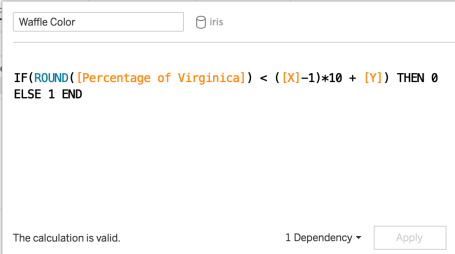
Presto! Now we can finalize the beautiful waffle chart!


33% of the flowers in the iris dataset belong to the virginica species.

The End – Enjoy your Waffles!

To leave a comment for the author, please follow the link and comment on their blog: Posts on Anything Data.

R-bloggers.com offers daily e-mail updates about R news and tutorials on topics such as: Data science, Big Data, R jobs, visualization (ggplot2, Boxplots, maps, animation), programming (RStudio, Sweave, LaTeX, SQL, Eclipse, git, hadoop, Web Scraping) statistics (regression, PCA, time series, trading) and more...

This posting includes an audio/video/photo media file: Download Now

Comments