Data can be very powerful, but it's useless if you can't interpret it or navigate through it. For this reason, it's crucial to have an interactive and understandable visual representation of your data. To achieve this, we frequently use dashboards. Dashboards are the perfect tool for creating coherent visualizations of data for business and scientific applications. In this tutorial we'll teach you how to build and customize a simple Shiny dashboard.
We'll walk you through the following:
Importing library(shiny) and library(shinydashboard)
Creating a server function
Setting up a dashboardPage() and adding UI components
Displaying a correlation plot
Adding basic interactivity to the plot
Setting up navigation with dashboardSidebar()
Using fluidPage()
Data tables with library(DT)
Applying dashboard skins
Taking advantage of semantic UI with library(semantic.dashboard)
Want more tutorials? Tell us what you'd like to learn in the comments.
[This article was first published on François Husson, and kindly contributed to R-bloggers]. (You can report issue about the content on this page here) Want to share your content on R-bloggers? click here if you have a blog, or here if you don't.
The newest version of R package Factoshiny (2.2) is now on CRAN! It gives a graphical user interface that allows you to implement exploratory multivariate analyses such as PCA, correspondence analysis, multiple factor analysis or clustering. This interface allows you to modify the graphs interactively, it manages missing data, it gives the lines of code to parameterize the analysis and redo the graphs (reproducibility) and it proposes an automatic report on the results of the analysis.
[This article was first published on R – Win-Vector Blog, and kindly contributed to R-bloggers]. (You can report issue about the content on this page here) Want to share your content on R-bloggers? click here if you have a blog, or here if you don't.
A client recently came to us with a question: what's a good way to monitor data or model output for changes? That is, how can you tell if new data is distributed differently from previous data, or if the distribution of scores returned by a model have changed? This client, like many others who have faced the same problem, simply checked whether the mean and standard deviation of the data had changed more than some amount, where the threshold value they checked against was selected in a more or less ad-hoc manner. But they were curious whether there was some other, perhaps more principled way, to check for a change in distribution.
Income and Age distributions in US Census Data
Let's look at a concrete example. Below we plot the distribution of age and of income (plotted against a log10 scale for clarity) for two data samples. The "reference" sample is a small data set based on data from the 2001 US Census PUMS data; the "current" sample is a much larger data set based on data from the 2016 US Census PUMS data. (See the notes below for links and more details about the data).
Does it appear that distributions of age and income have changed from 2001 to 2016?
The distributions of age look quite different in shape. Surprisingly the difference in the summary statistics is not really that large:
dataset
mean
sd
median
IQR
2001
51.699815
18.86343
50
26.000000
2016
49.164738
18.08286
48
28.000000
% diff from 2001
-4.903455
-4.13805
-4
7.692308
In this table we are comparing the mean, standard deviation, median and interquartile range (the width of the range between the 25th and 75th percentiles). The mean and median have only moved by two years, or about 4-5% from the reference. The summary statistics don't clearly show the pulse of younger population that appears in the 2016 data, but not in the 2001 data.
The income distributions, on the other hand, don't visually appear that different, at least at this scale of the graph, but a look at the summary statistics shows a distinct downward trend in the mean and median, about 20-25%, from 2001 to 2016. (Note that both these data sets are example data sets for Practical Data Science with R, first and second editions respectively, and have been somewhat altered from the original PUMS data for didactic purposes, so differences we observe here may not be the same as in the original PUMS data).
dataset
mean
sd
median
IQR
2001
53504.77100
65478.06573
35000.00000
52400.00000
2016
41764.14840
58113.76466
26200.00000
41000.00000
% diff from 2001
-21.94313
-11.24697
-25.14286
-21.75573
Is there a way to detect differences in distributions other than comparing summary statistics?
Comparing Two Distributions
One way to check if two distributions are different is to define some sort of "distance" between distributions. If the distance is large, you can assume distributions are different, and if it is small, you can assume the distribution is the same. This gives us two questions: (1) How do you define distance and (2) How do you define "large" and "small"?
Distances
There are several possible definitions of distance for distributions. The first one I thought of was the Kullback-Leibler divergence, which is related to entropy. The KL divergence isn't a true distance, because it's not symmetric. However, there are symmetric variations (see the linked Wikipedia article), and if you are always measuring distance with respect to a fixed reference distribution, perhaps the asymmetry doesn't matter.
Other distances include the Hellinger coefficient, Bhattacharyya distance, Jeffreys distance, and the Chernoff coefficient. This 1989 paper by Chung, et.al gives a useful survey of various distances and their definitions.
In this article, we will use the Kolmogorov–Smirnov statistic, or KS statistic, a simple distance defined by the cumulative distribution functions of the two distributions. This statistic is the basis for the eponymous test for differences of distributions (a "closed form" test that is present in R), but we will use it to demonstrate the permutation test based process below.
KS Distance
The KS distance, or KS statistic, between two samples is the maximum vertical distance between the empirical cumulative distributions functions (ECDF) of each sample. Recall that the cumulative distribution function of a random variable X, CDF(x), is the probability that X ≤ x. For example, for a normal distribution with mean 0, CDF(0) = 0.5, because the probability that any sample point drawn from that distribution is less than zero is one-half.
Here's a plot of the ECDFs of the incomes from the 2001 and 2016 samples, with the KS distance between them marked in red. We've put the plot on a log10 scale for clarity.
Now the question is: is the observed KS distance "large" or "small"?
Determining large vs small distances
You can say the KS distance D that you observed is "large" if you wouldn't expect to see a distance larger than D very often when you draw two samples of the same size as your originals from the same underlying distribution. You can estimate how often that might happen with a permutation test:
Treat both samples as if they were one large sample ("concatenate" them together), and randomly permute the index numbers of the observations.
Split the permuted data into two sets, the same sizes as the original sets. This simulates drawing two appropriately sized samples from the same distribution.
Compute the distance between the distributions of the two samples.
Repeat N times
Count how often the distances from the permutation tests are greater than D, and divide by N
This gives you an estimate of your "false positive" error: if you say that your two samples came from different distributions based on D, how often might you be wrong? To make a decision, you must already have a false positive rate that you are willing to tolerate. If the false positive rate from the permutation test is smaller than the rate you are willing to tolerate, then call the two distributions "different," otherwise, assume they are the same.
The estimated false positive rate from the test is the estimated p-value, and the false positive rate that you are willing to tolerate is your p-value threshold, and we've just reinvented a permutation-based version of the two-sample KS test. The important point is that this procedure works with any distance, not just the KS distance.
Permutation tests are essentially sampling without replacement; you could also create your synthetic tests by sampling with replacement in step 2 (this is generally known as bootstrapping). However, permutation tests are the traditional procedure for hypothesis testing scenarios like the one we are discussing.
How many permutation iterations?
In principle, you can run an exact permutation test by trying all factorial(N+M) permutations of the data (where N and M are the sizes of the samples), but you probably don't want to do that unless the data is really small. If you want a false positive rate of about ϵ, it's safer to do at least 2/ϵ iterations, to give yourself a reasonable chance of seeing an 1/ϵ-rare event.
In other words, if you can tolerate a false positive rate of about 1 in 500 (or 0.002), then do at least 1000 iterations. We'll use this false positive rate and that many iterations for our experiments, below.
If we permute the income distributions for 2001 and 2016 together for 1000 iterations, and compare it to the actual KS distance between the two samples, we get the following:
This graph shows the distribution of KS distances we got from the permutation test in black, and the actual KS distance between the 2001 and 2016 samples with the red dashed line. This KS distance was 0.104, which is larger than any of the distances observed in the permutation test. This gives us an estimated false positive rate of 0, which is certainly smaller than 0.002, so we can call the distributions of incomes in the 2016 sample "different" (or "significantly different") from the distribution of incomes in the 2001 sample.
We can do the same thing with age.
Again, the distributions appear to be significantly different.
Alternative: Running the KS test with ks.boot()
A very similar procedure for using KS distance as a measure of difference is implemented by the ks.boot() function, in the package Matching. Let's try ks.boot() on income and age. Again, for a p-value threshold of 0.002, you want to use at least 1000 iterations.
library(Matching) # for ks.boot# incomeks.boot(newdata$income, reference$income, nboots =1000) # the default
## $ks.boot.pvalue ## [1] 0 ## ## $ks ## ## Two-sample Kolmogorov-Smirnov test ## ## data: Tr and Co ## D = 0.10385, p-value = 1.147e-09 ## alternative hypothesis: two-sided ## ## ## $nboots ## [1] 1000 ## ## attr(,"class") ## [1] "ks.boot"
# ageks.boot(newdata$age, reference$age, 1000)
## $ks.boot.pvalue ## [1] 0 ## ## $ks ## ## Two-sample Kolmogorov-Smirnov test ## ## data: Tr and Co ## D = 0.075246, p-value = 2.814e-05 ## alternative hypothesis: two-sided ## ## ## $nboots ## [1] 1000 ## ## attr(,"class") ## [1] "ks.boot"
In both cases, the value $ks.boot.pvalue is less than 0.002, so we would say that both the age and income distributions from 2016 are significantly different from those in 2001.
The value $ks returns the output of the "closed-form" KS test (stats::ks.test()). One of the reasons that the KS test is popular for this application is that under certain conditions (large samples, continuous data with no ties), the exact distribution of the KS statistic is known, and so you can compute exact p-values and/or compute a rejection threshold for the KS distance in a closed-form way, which is faster than simulation.
With large data sets, the KS test seems fairly robust to ties in the data, and in this case the p-values returned by the closed-form estimate give decisions consistent with the estimates formed by resampling. However, using ks.boot means you don't have to worry if the closed form estimate for p is valid for your data. And of course, the resampling approach works for any distance estimate, not just the KS distance.
Discrete Distributions
The nice thing about the resampling version of the KS test is that you can use it on discrete distributions, which are problematic for the closed form version of the test. Let's compare the number of vehicles per respondent in the 2001 sample compared to the 2016 sample. The graph below compares the fraction of the total datums in each bin, rather than the absolute counts.
(Note: the data is actually reporting the number of vehicles per household, and in reality there may be multiple respondents per household. But for the purposes of this exercise we will pretend that there is only one respondent per household in the samples).
Let's try the permutation and the bootstrap tests to decide if these samples are distributed the same way.
## $ks.boot.pvalue ## [1] 0 ## ## $ks ## ## Two-sample Kolmogorov-Smirnov test ## ## data: Tr and Co ## D = 0.066833, p-value = 0.0004856 ## alternative hypothesis: two-sided ## ## ## $nboots ## [1] 1000 ## ## attr(,"class") ## [1] "ks.boot"
Both tests say that two distributions seem significantly different (relative to our tolerable false positive error rate of 0.002). ks.test() also gives a p-value that is smaller than 0.002, so it would also say that the two distributions are significantly different.
Conclusions
When you want to know whether the distribution of your data has changed, or simply want to know whether two data samples are distributed differently, checking summary statistics may not be sufficient. As we saw with the age example above, two data samples with similar summary statistics can still be distributed differently. So it may be preferable to find a metric that looks at the overall "distance" between two distributions.
In this article, we considered one such distance, the KS statistic, and used it to demonstrate a general resampling procedures for deciding if a specific distance is "large" or "small."
In R, you can use the function ks.test() to calculate KS distance (as ks.test(...)$statistic). If your data samples are large and sufficiently "continuous-looking" (zero or few ties), then ks.test() also provides a criterion (the p-value) to help you decide whether to call two distributions "different". Using this closed form test is certainly faster than resampling. However, if you have discrete data, or are otherwise not sure that the p-value estimate returned by ks.test() is valid, then resampling with Matching::ks.boot() is a more conservative approach. And of course, resampling approaches are generally applicable to what ever distance metric you choose.
Notes
The complete code for the examples in this article can be found in the R Markdown document KSDistance.Rmdhere. The document calls a file of utility functions KSUtils.R, here.
[This article was first published on RStudio Blog, and kindly contributed to R-bloggers]. (You can report issue about the content on this page here) Want to share your content on R-bloggers? click here if you have a blog, or here if you don't.
Over the years, we have loved interacting with the Shiny community and loved seeing and sharing all the exciting apps, dashboards, and interactive documents Shiny developers have produced. So last year we launched the Shiny contest and we were overwhelmed (in the best way possible!) by the 136 submissions! Reviewing all these submissions was incredibly inspiring and humbling. We really appreciate the time and effort each contestant put into building these apps, as well as submitting them as fully reproducible artifacts via RStudio Cloud.
And now it's time to announce the 2020 Shiny Contest, which will run from 29 January to 20 March 2020. (Actually, we announced it at rstudio::conf(2020), but now it's time to make it blog-official!)
You can submit your entry for the contest by filling the form at rstd.io/shiny-contest-2020. The form will generate a post on RStudio Community, which you can then edit further if you like. The deadline for submissions is 20 March 2020 at 5pm ET. We strongly recommend getting in your submission a few hours before this time so that you have ample time to resolve any last minute technical hurdles.
You are welcome to either submit your existing Shiny apps or create one in two months. And there is no limit on the number of entries one participant can submit. Please submit as many as you wish!
Requirements
Data and code used in the app should be publicly available and/or openly licensed.
If you're new to RStudio Cloud and shinyapps.io, you can create an account for free. Additionally, you can find instructions specific to this contest here and find the general RStudio Cloud guide here.
Criteria
Just like last year, apps will be judged based on technical merit and/or on artistic achievement (e.g., UI design). We recognize that some apps may excel in one of these categories and some in the other, and some in both. Evaluation will be done keeping this in mind.
Evaluation will also take into account the narrative on the contest submission post as well as the feedback/reaction of other users on RStudio Community. We recommend crafting your submission post with this in mind.
Awards
Honorable Mention Prizes:
One year of shinyapps.io Basic plan
A bunch of hex stickers of RStudio packages
A spot on the Shiny User Showcase
Runner Up Prizes:
All awards above, plus
Any number of RStudio t-shirts, books, and mugs (worth up to $200)
Grand Prizes:
All awards above, and
Special & persistent recognition by RStudio in the form of a winners page, and a badge that'll be publicly visible on your RStudio Community profile
Half-an-hour one-on-one with a representative from the RStudio Shiny team for Q&A and feedback
Please note that we may not be able to send t-shirts, books, or other items larger than stickeers to non-US addresses.
The names and work of all winners will be highlighted in the Shiny User Showcase and we will announce them on RStudio's social platforms, including community.rstudio.com (unless the winner prefers not to be mentioned). This year's competition will be judged by Winston Chang and Mine Çetinkaya-Rundel.
We will announce the winners and their submissions on the RStudio blog, RStudio Community, and also on Twitter.
[This article was first published on R by R(yo), and kindly contributed to R-bloggers]. (You can report issue about the content on this page here) Want to share your content on R-bloggers? click here if you have a blog, or here if you don't.
RStudio::Conference 2020 was held in San Francisco, California and kick started a new decade for the R community with a bang! Following some great workshops on a wide variety of topics such as JavaScript for Shiny Users to Designing the Data Science Classroom there were two days full of great talks as well as the Tidyverse Dev Day the day after the conference.
This was my third consecutive RStudio::Conf and I am delighted to have gone again, especially as I grew up in the Bay Area. For the second year running I am writing a roundup blog post on the conference (see last year's here).
Another great resource for the conference (besides the #rstats / #RStudioConf2020 Twitter) is the RStudioConf 2020 Slides Github repo curated by Emil Hvitfeldt.
Unfortunately, I arrived to the conference late as United Airlines being the fantastic service that they are cancelled my flight. So, I came into SFO right around when JJ Allaire was giving his fantastic keynote on RStudio becoming a Public Benefit Corporation (read more about that here) among other morning talks. I missed the first half of Day 1 and arrived extremely tired to the conference venue for lunch.
Grousing about United Airlines aside, let's get started!
NOTE: As with any conference there were a lot of great talks competing against each other in the same time slot and I also wasn't able to write about all the talks I saw in this blog post.
Mine gave a bit of background on the creation of the contest, mainly on how it was inspired by the {bookdown} contest that Yihui Xie organized a few years prior.
For this year's contest, taking place from January 29th to March 20th, Mine talked about some of the requirements and nice-to-haves from feedback and reflection on last year's contest.
Requirements:
Code (Github repo)
RStudio Cloud hosted project
Deployed App
Nice To Have:
Summary (in submission post)
Highlights
Screenshot
Also Mine mentioned how participants should self-categorize themselves by experience level, should start reviewing submissions earlier (HUGE uptick in submissions in the last weeks of the contest), and that organizers should give out better guidelines for what makes a "good" submission. For evaluations, apps will be judged based on technical and/or artistic achievement while also considering the feedback and reaction from the RStudio Community submission post.
More Shiny apps have been added to a revamped Shiny Gallery page!
Technical Debt is a Social Problem
Gordon Shotwell talked about how technical debt is a social problem and not just a technical one. Technical debt can be defined as taking shortcuts that make a product/tool less stable and the social aspect of this is that it can also be accumulated through bad documentation and/or bad project organization. With some experience being in a position where he lacked the necessary decision-making power to fix certain problems, Gordon's talk was heavily influenced by how he had to be strategic about creating robust solutions and how he came to realize that technical debt was both a failure of communication and consideration.
Communication:
Documentation (Use/Purpose of the Code)
Testing (Correctness of the Code)
Coding Style (Consistency/Legibility of the Code)
Project Organization (Organization of the Code)
Consideration:
Robustness (Accurate/Unambiguous Error Messages?)
Updated Easily
Solves Future Problems
Dependencies (Dependency Management)
Scale (Up/Down?)
From the above, Gordon asked everyone: How well do you think about how other people might use your code/software to fix problems?
The key to answering this question is to build what Gordon called "delightful products":
One-step Setup
Clear Problem
Obvious First Action
Path to Mastery
Help is Available
Never Breaks
To build these "delightful products" Gordon went over 3 concepts, find the right beachhead, separate users and maintainers, and empathize with the debtor.
Find the Right Beachhead: You should pick the correct battle to fight and position yourself for smart deployment. If you can then accomplish the project, you build trust! To do this, make a big improvement in a small area, work on a small contained project.
Separate Users & Maintainers: Users Get Coddled & Maintainers Get Opinions!: A good maintainer has responsibility and authority for the "delightful" product. He/she does not blame the user or asks users to maintain the tool. A good user defines what makes the product "delightful" and asks maintainers about the problem rather than the solution.
Empathize with the Debtor: Technical debt can make people/you uncomfortable and its important to be supportive so everyone can learn from the experience!
In conclusion, Gordon said that you should thank your code and that technical debt is a good thing. This is because even if there are some problems there are people who care enough to have done something about it in the first place and from there maintainers and users can work together to review and improve your tools!
In her keynote talk to kick start Day 2, Jenny Bryan talked about debugging your R code. Jenny went over four key concepts: hard reset, minimal reprex, debugging, deterring.
Hard resetting is basically the old "have you tried turning it off and then on again?" and in the context of R it is restarting your R session (you can set a keyboard shortcut via the "Tools" button in the menu bar). However, it's also very important that you make sure you are not saving your .Rdata on exit. This is so you have a completely clean slate when you restart your session. Another warning Jenny gave was that you should not use rm(list = ls()) as this doesn't clean any library() calls or sys.setenv() calls among a few other important things that might be causing the issue.
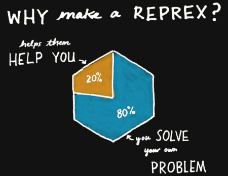
Making a minimal reprex means to make a small concrete reproducible example that either reveals/confirms/eliminates something about your issue. Jenny also described them as making a beautiful version of your pain that other people are more likely to engage with. Making one is very easy now with the {reprex} package and it helps those people trying to help you with your problem on Stack Overflow, RStudio Community, etc. Still, asking and formulating your question can be very hard as you need to work hard on bridging the gap between what you think is happening vs. what is actually happening.
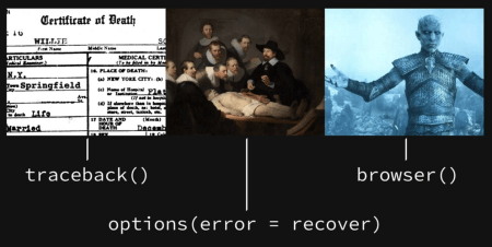
Debugging comprises of a few different steps and Jenny used death as a metaphor. "Death certificate" was used for functions like traceback() which shows exactly where and which functions were run to produce the error. "Autopsy" was used for option(error = recover) for when you need to look into the actual environment of certain function calls when they errored. Finally, reanimation/resuscitation was used for browser() and debug()/debugonce() as it allows you to re-enter the code and its environment right before the error or to the very top of the function (depending on where you insert the browser() call).
Deterring is that once you fix your code once you want to keep it fixed. The best way to do this is to add tests and assertions using packages like {testthat} and {assertr}. You can also automate these checks using continuous integration methods such as Travis CI or Github Actions. Lastly, Jenny talked about when writing code it's important to write error messages that are easy for humans to understand!
The {renv} package (an RStudio project led by the presenter, Kevin Ushey) is the spiritual successor to {packrat} for dependency management in R. When we talk about libraries in R, the most basic definition is "a directory into which packages are installed". Each R session is configured to use multiple library paths, you can see for yourself using the .libPaths() function, and a "user" and "system" library is usually the default that everybody has. You can also use find.package() to find where exactly a package is located on your system. The challenge with package management in R is that by default, each R session uses the same set of library paths. For different R projects you might have different package dependencies, however if you install a new version of a package, it will change the version of that package in every project.
The three key concepts of {renv} work to make your R projects more:
Isolated: Each project gets its own library of R packages, this allows you to upgrade and change packages within your project but not break your other projects!
Portable: {renv} captures the state of R packages in a project within a LOCKFILE. This LOCKFILE is easy share and makes collaborating with others easy as everybody working from a common base of R packages.
Reproducible: Using the renv::snapshot() function lets you save state of R library to LOCKFILE, called "renv.lock".
The basic workflow for {renv} is as follows:
renv::init(): This function activates {renv} for your project. It forks the state of your default R libs into a project-local library and prepares infrastructure to use {renv} for the project. A project-local .Rprofile is created/amended for new R sessions for that project.
renv::snapshot(): This function captures the state of your project library and write that to a LOCKFILE, "renv.lock".
renv::restore(): This function shows all the packages that are updated/installed in the project-local library as a list. It restores your project library with the state specified in the LOCKFILE that you created previously with renv::snapshot().
{renv} can install packages from many sources, Github, Gitlab, CRAN, Bioconductor, Bitbucket, and private repositories with authentication. As there may be many duplicates of identical packages across projects, {renv} also uses a global package cache to keep your disk space clean and to lower installation times when restoring your packages.
In another talk by an RStudio employee, Jonathan McPherson talked about the exciting new features in store for RStudio version 1.3.
For this version one of the key concepts was to increase accessibility of RStudio for those with disabilities by targeting the WCAG 2.1 Level AA:
Increased compatibility with screen readers (annotations, landmarks, navigation panel options)
Better focus management (where the keyboard focus is at any given moment)
Better keyboard navigation and usability (no more tab traps!)
Better UI readability (improve contrast ratios)
The Spell Check tool, which in the past did not provide real-time feedback, could only read the entire document at a time, and the button itself being hard to find, is significantly revamped with new features many R users have been crying out for:
Real-time spell checking
Pre-loaded dictionary ("RStudio" is also included now!)
Right-click for suggestions
Works on comments and roxygen comments
In addition, the global replace tool is also improved in that you can replace everything found with a new string, regex support, and that you can preview your changes in real time.
Although RStudio already worked in prior versions of the iPad the new OS 13 makes everything much more smoother and gives the user a much better experience. In light of the fact that RStudio and the iPad work much better together version 1.3 on the iPad will have much better keyboard support (shortcuts and arrow-keys support)!
Another exciting feature is the ability to script all your RStudio configurations. Every configurable option available from the "Global options", "workbench key bindings", "themes", "templates" are saved as plain text (JSON) files in the ~/.config/rstudio folder and can be set by admins for all users on RStudio Server as well.
You can try out a preview version of 1.3 today here!
In this afternoon talk, Hadley Wickham talked about the big tidyverse hits of 2019 and what's to come in 2020.
Some of the highlights for 2019 included:
citation("tidyverse"): Which allows people to cite the tidyverse in their academic papers
The " (read: curly-curly) operator: Which reduces the cognitive load for many users confused about all of the new {rlang} syntax
{vctrs}: A developer-focused package for creating new classes of S3 vectors
{vroom}: A fast delimited reader for R, using C++ 11 for multi-threaded computations, as well as the Altrep framework to lazy-load the data only when the user needs it
{tidymodels}: A group of packages for modelling with tidy principles ({rsample}, {recipes}, {parsnip}, etc.)
For 2020, Hadley was most excited about:
{dplyr 1.0.0}
A movement toward more problem oriented documentation.
Less {purrr}: replacement with more functions to handle tasks like importing multiple files at once or tuning multiple models.
{googlesheets4}: Reboot of the old {googlesheets}, improved R interface via the Sheets API v4.
Hadley then talked about some of the lessons learned from the new tidyeval functionalities last year. Some of the mistakes that he talked about was that a lot of previous tidyeval solutions were too partial/piece-meal and that there was too much focus on theory relative to the realities of most data science end-users. Most of the problems identified could be traced to the fact that there was way too much new vocabluary to learn regarding tidyeval. Going forward, Hadley says that they want to get feedback without exposing a lot of new functionality at once and to a specific set of test users while also working to indicate that certain new concepts are still Experimental more clearly.
To make it easier for users to keep track of all the changes happening around the tidyverse packages, a lot more emphasis on the exact "life cycle" of functions are now listed in the documentation. Starting out as "Experimental" then going to "Stable", if going under review to "Questioning", and finally to "Deprecated", "Defunct", or "Superseded" these tags inform the user about the working status of functions in a package.
The main differences between deprecated and superseded are:
Deprecated: A function that's on its way out (at least in the near future, < 2 years) and gives a warning when used. Ex. dplyr::tbl_df() & dplyr::do()
Superseded: There is an alternative approach that is easier to use/more powerful/faster. It is recommended that you learn new approach if you have spare time but it's not going anywhere (however only critical bug fixes will be made to it). Ex. spread()& gather()
As we head into another decade of the {tidyverse} this presentation provided a good overview of what's been going on and what's more to come!
In the afternoon session of Day 2 there was an entire section of talks devoted to {ggplot2}.
First, there was Dewey Dunnington's presentation on best practices for programming with {ggplot2}, a lot of the material which you might be familiar with from his Using ggplot2 in packages vignette (only available in the not-yet-released version 3.3.0 documentation) last year. In the first section Dewey talked about using tidy evaluation in your mappings and facet specifications when you're creating custom functions and programming with {ggplot2}. For using {ggplot2} in packages he talked about proper NAMESPACE specifications and getting rid of pesky "undefined variable" notes in your R CMD check results. Lastly, Dewey went over a demo on regression testing your {ggplot2} output with the {vdiffr} package.
Next, Claus Wilke talked about his {ggtext} package which adds a lot of functionality to {ggplot2} with the addition of formatted text. With {ggtext} you can use markdown or HTML syntax to format the text in any place where text can appear in a ggplot. This is done via specifying element_markdown() instead of element_text() in the theme() function in your ggplot2 code. Synchronizing with the {glue} package you can refer to values inside columns of your dataframe and style them in a very easy way.
{ggtext} also allows you to insert images into the axes by supplying the HTML tag for the picture into the label.
In conclusion, Claus mentioned that another package of his, {gridtext}, does a lot of the heavy lifting to render formatted text in the 'grid' graphics system. He also warned everybody to not get too carried away with the awesome new functionalities to ggplot that {ggtext} introduces!
Next, Dana Seidel presented on version 1.1.0 of the {scales} package which provides the internal scaling infrastructure for {ggplot2} (but also works with base R graphics as well). The {scales} package focuses on five key aspects of data scales: transformations, bounds & rescaling, breaks, labels, and palettes.
Some of the notable changes in this new version include the renaming of functions for better consistency and to make it easier to tab complete functions in the package as well as providing more examples via the demo_*() functions.
While most of the conventional data transformations are included in the package such as arc-sin square root (atanh_trans()), Box-Cox (boxcox_trans()), exponential (exp_trans()), Pseudo-log ), etc. users can now define and build their own transformations using the trans_new() function!
Next, Dana introduced some rescaling functions:
One of the things that got the crowd really excited was the scales::show_col() function which allows you to check out colors inside a palette. This function is well-known to a lot of {ggplot2} color palette package creators (including myself for {tvthemes}) to showcase all the great new sets of colors we've made without having to draw up an example plot!
Last but certainly not least, Thomas Pedersen presented on extending {ggplot2} and really looking underneath the hood of a package most people can use, but has been quite a challenge to work with the internals.
This presentation got quite technical and a bit too advanced for me so I'll refrain from doing a bad explanation on it here. However, it was still educational as developing my own {ggplot2} extension (creating actual new geoms/stats rather than just using existing {ggplot2} code) is something that I've been dying to do. There's going to be a new chapter in the new and under development version 3 of the {ggplot2} book and more materials in the future on this so keep an eye out!
In this lightning talk, Maria Teresa Ortiz, talked about her {quickcountmx} package which is a package that provides functions to help estimate election results using Stan. As official counts from elections can take weeks to process this package was used to take a proportional stratified sample of polling stations to provide quick-count estimates (based on a Bayesian hierarchical model) for the 2018 Mexican presidential election.
As part of one of the teams on the committee who provided the official quick-count results, this package was created so that it would be easy to share code amongst the team members and to provide some transparency about the estimation process as well as to get feedback from other teams (as all the teams in the committee used R!).
Katherine Simeon talked about analyzing the R Ladies Official Twitter account using {tidytext}. The @WeAreRLadies account started in August 2018 and since then has accumulated over 15.5K followers and has had 56 different curators from 19 different countries. These curators rotate on a weekly basis and discuss via tweets their R experiences with the community on a variety of topics such as how they use R, tips, tricks, favorite resources, learning experiences, and other ways to engage with the #rstats/#RLadies community online. Katherine then took a look at the sentiments expressed in @WeAreRLadies tweets and made some nice ggplots to highlight certain emotions while also providing some commentary on some of the best tweets from the account.
It was very cool seeing the different curators and the different things the RLadies account talked about and Katherine provided a link to those who want to curate the account in the slides!
As this was the third Tidy Dev Day there were some improvements following lessons learnt from the first two iterations in Austin 2019 (my blog post on it here) and in Toulouse 2019. This time around post-it notes were stuck on a wall divided into groups of different {tidyverse} package and you had to take the post-its to "claim" the issue. After you PR'd the issue you were working on you can place your post-it under the "review" section of the wall and wait while a tidyverse dev looked at your changes. Once approved, they will move your sticker into the "merged" section. Once you have your post-it in the "merged" section you can SMASH the gong to raucous applause from everybody in the room, congratulations – you've contributed to a {tidyverse} package!
What I also learned from this event was using the pr_*() family of functions in the {usethis} package. I'm quite familiar with {usethis} as I use it at work often but until TidyDev Day I hadn't used the newer Pull Request (PR) functions as I normally just did that manually on Github. The {usethis} workflow, which was also posted on the Tidy Dev Day README in more detail, was as follows:
Fork & clone repo with usethis::create_from_github("{username}/{repo}").
Make sure all dependencies are installed with devtools::install_dev_deps(), restart R, then devtools::check() to see if everything is running OK.
Create a new branch of the repo where you'll make all your fixes with usethis::pr_init("very-brief-description")
Make your changes: Be sure to document, test, and check your code.
Commit your changes
Push & Pull Request from R via usethis::pr_push()
For naming new branches I normally like to provide ~3 words starting with an action verb (create/modify/edit/refactor/etc.) and then at the end add the Github issue number. Example: edit-count-docs-#2485.
I was working on some documentation improvements for {ggplot2}. Getting help and working next to both Claus Wilke and Thomas Pedersen was delightful as I use {cowplot} and {ggforce} extensively (not to mention {ggplot2}, obviously) but of course, I was very nervous at first!
Conclusion
Shoutout to some great presentations that I missed for a variety of reasons like:
I'm really looking forward to watching them on video soon!
On the evening/night of the first day of the conference was a special reception event at the California Academy of Sciences! After a long day everybody got together for food, drink, and looking at all the flora/fauna on exhibit. This was also where I met some of my fellow R Weekly editorial team members for the first time! I also think this might have been the first time that four editors were at the same place at the same time!
Outside of the conference I went to visit Alcatraz for the first time since I was a little kid along with first-time visitors, Mitch and Garth. That night I went to go see my favorite hockey team, the San Jose Sharks, play live at the Shark Tank for what feels like the first time in forever!
This was my third consecutive RStudio::Conf and I enjoyed it quite a lot. As the years have gone by I've talked to a lot of people on #rstats and it's been a great opportunity to meet more and more of these people in real life at these kind of events. The next conference is in Orlando, Florida from January 18 to 21 and I've already got my tickets, so I hope to see more of you all there!
To leave a comment for the author, please follow the link and comment on their blog: R by R(yo).
[This article was first published on R on notast, and kindly contributed to R-bloggers]. (You can report issue about the content on this page here) Want to share your content on R-bloggers? click here if you have a blog, or here if you don't.
Recap
Previously in this series, we discovered the equivalent python data structures of the following R data structures:
In this post, we will look at translating R arrays (and matrixes) into python.
1D R array
A 1D R array prints like a vector.
library(tidyverse) library(reticulate) py_run_string("import numpy as np") py_run_string("import pandas as pd") (OneD<-array(1:6))
## [1] 1 2 3 4 5 6
But it is not truly a vector
OneD %>% is.vector()
## [1] FALSE
It is more specifically an atomic.
OneD %>% is.atomic()
## [1] TRUE
An atomic is sometimes termed as an atomic vector, which adds more to the confusion. ?is.atomic explains that "It is common to call the atomic types 'atomic vectors', but note that is.vector imposes further restrictions: an object can be atomic but not a vector (in that sense)". Thus, OneD can be an atomic type but not a vector structure.
1D R array is a python…
No tricks here. A R array is translated into a python array. Thus, a 1D R array is translated into a 1D python array. The name of the python array is known as ndarray and is governed by the python packaged called numpy.
r.OneD
## array([1, 2, 3, 4, 5, 6])
type(r.OneD)
##
r.OneD.ndim
## 1
All python code for this post will be run within the {python} code chunk to explicitly print out the display for python array (i.e. array([ ]) )
1D python array is a R…
1 dimension python arrays are commonly used in data science for python.
p_one= np.arange(6) p_one
## array([0, 1, 2, 3, 4, 5])
The 1D python array is translated into a 1D R array.
py$p_one %>% class()
## [1] "array"
The translated array is an atomic type.
py$p_one %>% is.atomic()
## [1] TRUE
An the translated array is not a vector which is expected of a 1D R array.
py$p_one %>% is.vector()
## [1] FALSE
2D R array
A 2D R array is also known as a matrix.
(TwoD<-array(1:6, dim=c(2,3)))
## [,1] [,2] [,3] ## [1,] 1 3 5 ## [2,] 2 4 6
TwoD %>% class()
## [1] "matrix"
2D R array is a python…
A 2D python array. python does not name have a special name for their 2D array.
r.TwoD
## array([[1, 3, 5], ## [2, 4, 6]])
type(r.TwoD)
##
r.TwoD.ndim
## 2
2D python array
Besides from 1D python array, 2D python array are also common in data science with python.
p_two=np.random.randint(6, size=(2,3)) p_two
## array([[2, 5, 2], ## [1, 0, 1]])
A 2D python array is translated into a 2D R array/ matrix.
py$p_two %>% class()
## [1] "matrix"
Reshaping 1D python array into 2D array
Sometimes a python function requires a 2 dimension array and your input variable is a 1 dimension array. Thus, you will need to reshape your 1 dimension array into a 2 dimension array with numpy's reshape function. Let us convert our 1 dimension array into a 2 dimension array which has 2 rows and 3 columns.
np.reshape(p_one, (2,3))
## array([[0, 1, 2], ## [3, 4, 5]])
Let's convert it into a 2D array which has 6 rows and 1 column.
The rows for the above is the same as the length of the 1D array. Thus, if you replace the 6 with the length of the 1D array, you will achieve the same result.
Alternatively, you can also replace it with -1 if the input is a 1D array. -1 means that it is unspecified and that it will "inferred from the length of the array".
#Difference between R and python array One of the differences is the printing of values in the array. R are column-major arrays. The tables are filled column-wise. In other words, the left most column is filled from the top to the bottom before moving to neighbouring right column. This neighbouring column is filled up in a top-down fashion.
TwoD
## [,1] [,2] [,3] ## [1,] 1 3 5 ## [2,] 2 4 6
The integrity of this column-major display is maintained when it is translated into python.
r.TwoD
## array([[1, 3, 5], ## [2, 4, 6]])
You would have noticed that python prints its array without the row (eg.[1,]) and column names (e.g. [,1]).
While python is able to use column-major ordered arrays, but it defaults to row-major ordering when arrays are created in python. In other words, values are filled from the first row in a left-to-right fashion before moving to the next row.
Besides lists, 1D arrays, 2D arrays, there are other python data structures which are commonly used in data science with python. They are series and data frames which are governed by the pandas library. We will look at series in this post and data frames will be covered in a separate post. Series is a 1D array with axis labels.
PD=pd.Series(['banana',2]) PD
## 0 banana ## 1 2 ## dtype: object
As series is a 1D array, when translated to R it will be classified as a R array.
py$PD %>% class()
## [1] "array"
However, the translated series appears as a R named list. The index of the series appear as the names in the R list.
py$PD
## $`0` ## [1] "banana" ## ## $`1` ## [1] 2
What did you know? A translated series is both a R array and R list
py$PD %>% is.array()
## [1] TRUE
py$PD %>% is.list()
## [1] TRUE
To leave a comment for the author, please follow the link and comment on their blog: R on notast.
[This article was first published on novyden, and kindly contributed to R-bloggers]. (You can report issue about the content on this page here) Want to share your content on R-bloggers? click here if you have a blog, or here if you don't.
If you are a professor teaching or a student enrolled in machine learning program or non-technical program with a machine learning hands-on lab becoming a member of the H2O.ai Academic Program will get you free access to non-commercial use of software license for education and research purposes. Since November 2018 H2O.ai (my employer) made its ground-breaking automated machine learning (AutoML) platform Driverless AI available to academia for free.
To find out how Driverless AI automates machine learning activities into integral and repeatable workflow seamlessly encompassing feature engineering, model validation and parameter tuning, model selection and ensembling, custom recipes for transformers, models and scorers, and finally model deployment click on the link. Not to forget MLI (Machine Learning Interpretability) module that offers tools for both white and black box model interpretability, model debugging, disparate impact analysis, and what-if (sensetivity) analysis.
H2O.ai Academic Program
To sign up to the H2O Academic Program launched back in October of 2018 start by filling out this formgiven following conditions hold true:
intended use is non-commercial for education and research purposes only and
person belongs to higher education institution or is a student currently enrolled in a higher education degree program and
if a student then academic status can be verified by sending a photo of your current student ID to academic@h2o.ai (required).
Upon approval H2O.ai will issue a free license for Driverless AI for non-commercial use only. While waiting to be approved apply for access to H2O.ai Community Slack channelhere and don't forget to join #academic).
Driverless AI Installation Options
After receiving a license key follow installation instructions for Mac OS X or Windows 10 Pro (via WSL Ubuntu option is highly preferred) to run Driverless AI on your workstation or laptop. While such approach suffices for small datasets serious problems demand installing and running Driverless AI on modern data center hardware with multiple CPUs and one or several GPUs for best results. There are several economical cloud providers for such solution with one of them utilized below. For general guidelines and instructions for native DEB installation on Linux Ubuntu see here. Steps below can be tracked back to this documentation.
Why Paperspace
Paperspace offers robust choice of configurations to provision and run Linux Ubuntu VMs with single GPU (no multi GPU systems available). The pricing appears competitive to suit thrifty academic budget by starting at around $0.50/hour for GPU systems with 30G of memory that should comfortably host Driverless AI. It also features simple streamlined interface to deploy and manage VMs.
After successfully creating account proceed to create a cloud VM:
3. Start Adding New Machine
Under Core -> Compute -> Machines on the left select (+) to add new machine:
4. Machine Location
Choose region closer to your location – in my case it was "East Coast (NY2)":
5. Choose Type Operating System
Scroll down to "Choose OS" and click on "Linux Templates":
6. Choose OS Version
Keep default Ubuntu 16.04 server image:
7. Pick Machine Type (How Much to Pay)
Scroll down to choose machine profile (keep hourly rate): for VM pick type "P4000" or more expensive machine type with GPU, while for CPU only system pick "C6" or higher (in case this instance type is not enabled instructions to enable it should pop up):
8. Enable Public IP
Scroll down to "Public IP" to enable it while keeping other settings unchanged except maybe for "Storage" and "Auto-Shutdown". While 50G of storage suffices for many applications if you plan on using larger datasets or create massive number of models increase your storage accordingly: allocate at least 20 times storage as the largest dataset you plan to use. Lastly change auto-shutdown timeout according to your needs:
9. Apply $10.00 Promo Code and Payment
Scroll down to payment to enter credit card information, enter promotion code 5NXWB5R to apply (Paperspace should credit your account $10.00) before finally creating VM with "Create Your Paperspace" button:
10. Creating VM
See system is in "Provisioning" state:
11. Wait for System to Start
Wait until after a minute or two system state changes to "On/Ready" and click on small gear:
12. System Console
System details view with information about VM opens including public IP address assigned to your VM:
13. Notificaiton from Paperspace
Next find email from Paperspace with system password:
With public IP address and password you can ssh (on Mac OS X or Linux) or connect using putty (on Windows) to paperspace VM and install Driverless AI software following steps for vanilla Ubuntu system. This example continues with this install to show all steps in detail.
Installing Prerequisites
14. Terminal Access to VM
ssh to Paperspace VM with from Mac OS terminal using Public IP and password as shown in steps 12 and 13 (ssh below is used on Mac OS X – for other OSes adjust accordingly):
17. Add support for NVIDIA GPU libraries (CUDA 10):
18. Install other prerequisites and open port Driverless AI listens to:
Installing Driverless AI
19. H2O Download Page
Leave (do not close) ssh terminal for a browser and locate H2O.ai download page. Choose latest version of Driverless AI product:
17. Download Link
Go to Linux (X86) tab and then right-click on the "Download" link for DEB package to copy link location:
18. Back to Terminal Access
Return to ssh terminal session connected to paperspace VM. If session timed out or became inactive repeat step 14.
19. Download and install Driverless AI DEB package:
20. Install Completed
After installer successfully finishes it displays following helpful information:
21. Start Driverless AI
Check that Driverless AI is installed but inactive and then start it and check yet again its status and logs:
22. Web Access
Open browser and enter URL with public IP address like this: http://209.51.170.97:12345 (ignore 127.0.0.1 in screenshot as I was using port forwarding when taking them):
23. License Agreement
Scroll down to accept license agreement:
24. Login to Driverless AI
Driverless AI display login screen – enter credentials h2oai/h2oai:
25. Activate License
Driverless AI prompts to Enter License to activate software license:
26. License Key
Enter Driverless AI license key received by enrolling to H2O.ai Academic Program and press Save:
27. All Done
Now Driverless AI platform is fully enabled to help in your research or studies or both:
The RStudio Conference in San Francisco last month was an amazing experience, and I will definitely attend again next year in Orlando. In this post, Pedro Coutinho Silva and I will share some packages and trends from the conference that might interest members of the R community who were unable to attend.
Pawel and Pedro in front of Pedro's rstudio::conf e-Poster
I'll start with Joe Cheng's presentation about styling Shiny apps. Joe demonstrated how the Sass package can improve workflows. It was important for me to see that beautiful user interface in Shiny has become a significant topic. I was particularly excited about the option
plot.autocolors=TRUE
which automatically adjusts the colors of your ggplot to fit your Shiny dashboard theme. This is interesting because the plot is an image that can't be styled with CSS rules. Joe Cheng received a great reaction from the audience when he demonstrated how it works. He set the plot option to true, and the plot magically changed its style to that of the whole application, which was styled with Sass. From a data scientists' perspective, this is super useful because they don't have to think about styling a specific image.
Pedro: Another small detail from Sass — which I think makes it a good package for data scientists — is that it allows you to pass variables to Sass. So you can pass variables that you have in your R code to Sass and use those values to style some color and other attributes. This is the detail that makes R/Sass something that data scientists will actually want to use. They already know how to call that function because they've called functions like this many times.
A slide from Joe Cheng's presentation: Sass is a better way to write CSS
Pawel: The tidyeval package is very useful. The concept of metaprogramming is powerful and with the recent improvements in the package, especially the
{{ }}
("curly curly" operator), it is much more convenient to use. For a quick introduction into the tidyeval concept I recommend Hadley Wickham's video: https://www.youtube.com/watch?v=nERXS3ssntw
Pedro: Tidyeval — they did something really powerful here. In the past their approach was perhaps too complicated for data scientists. So people weren't actually using it because it was too involved. This time around, they didn't create a whole new package; instead, they changed something major that people were complaining about. They changed tidyeval into a tool that is really easy to use, even for people who don't have a technical background. The big difference is that before, tidyeval was this really strange set of functions with an overly complicated syntax. It made no sense to data scientists because it looked complex, but if you instead just say "oh, you need to put your variable into something like this," then people understand it. Now it's much easier to use.
An enhancement to tidyeval: {{var}}
Pawel: I also liked the update from RStudio about version 1.3 of their IDE. Two enhancements caught my attention: (1) they added features for accessibility (especially for users with partial blindness), and (2) we will now have a portable configuration file.
Putting R in production was a popular topic at the conference. The T-Mobile team shared their story about building machine learning models and how they test performance. They created their own package called loadtest. They also created a website to chronicle their work: putrinprod.com. I like that productionizing R has become an important topic, only partly because our team at Appsilon excels in productionization and creating new packages.
I also enjoyed the reproducibility topic addressed by the shinymeta package. I like the whole concept of the ability to reproduce calculations on server side logic in Shiny apps. With shinymeta, you grab the code of specific server reactives and you can easily run this code outside of the Shiny runtime. I need a hackathon to explore it a bit!
The reproducibility topic was addressed by the shinymeta package
Ursa Labs shared a benchmark for reading and writing from Apache Parquet files. In their benchmark, Apache Parquet files could be read almost as fast as Feather files but the Parquet files were 30x smaller. In their comparison, Feather files were 4GB and Parquet files were 100MB. This is a massive difference. I remember in previous projects that we switched to Feather because reading the files was super fast, but the disadvantage was that Feather files were always prohibitively large. So this is an interesting development.
Reading/Writing Parquet files. Comparison with Feather
Pedro: At the conference, I also learned about the package Chromote. It allows you to run a Chrome session in R. You can start a new application, such as a Shiny dashboard. You can run specific scenarios and take a screenshot of the state of your application. This could be really cool and useful for testing.
Finally, I was interested in an e-poster session for the PAWS package. This is an abstraction of the API for AWS. From an R console you can manage your AWS resources. For example, you can start a new EC2 instance or a new batch job — basically everything you usually do with Ansible. This is super useful for data scientists who work mainly with R.
It was an exciting conference to say the least. I'm looking forward to the next rstudio::conf in Orlando on January 18-21!
Thanks for reading. For more, follow me on Twitter.
[This article was first published on Rstats on Julia Silge, and kindly contributed to R-bloggers]. (You can report issue about the content on this page here) Want to share your content on R-bloggers? click here if you have a blog, or here if you don't.
Last week I published my first screencast showing how to use the tidymodels framework for machine learning and modeling in R. Today, I'm using this week's #TidyTuesday dataset on hotel bookings to show how to use one of the tidymodels packages recipes with some simple models!
Here is the code I used in the video, for those who prefer reading instead of or in addition to video.
Explore the data
Our modeling goal here is to predict which hotel stays include children (vs. do not include children or babies) based on the other characteristics in this dataset such as which hotel the guests stay at, how much they pay, etc. The paper that this data comes from points out that the distribution of many of these variables (such as number of adults/children, room type, meals bought, country, and so forth) is different for canceled vs. not canceled hotel bookings. This is mostly because more information is gathered when guests check in; the biggest contributor to these differences is not that people who cancel are different from people who do not.
To build our models, let's filter to only the bookings that did not cancel and build a model to predict which hotel stays include children and which do not.
## # A tibble: 75,166 x 29 ## hotel lead_time arrival_date_ye… arrival_date_mo… arrival_date_we… ## ## 1 Reso… 342 2015 July 27 ## 2 Reso… 737 2015 July 27 ## 3 Reso… 7 2015 July 27 ## 4 Reso… 13 2015 July 27 ## 5 Reso… 14 2015 July 27 ## 6 Reso… 14 2015 July 27 ## 7 Reso… 0 2015 July 27 ## 8 Reso… 9 2015 July 27 ## 9 Reso… 35 2015 July 27 ## 10 Reso… 68 2015 July 27 ## # … with 75,156 more rows, and 24 more variables: ## # arrival_date_day_of_month , stays_in_weekend_nights , ## # stays_in_week_nights , adults , children , meal , ## # country , market_segment , distribution_channel , ## # is_repeated_guest , previous_cancellations , ## # previous_bookings_not_canceled , reserved_room_type , ## # assigned_room_type , booking_changes , deposit_type , ## # agent , company , days_in_waiting_list , ## # customer_type , adr , required_car_parking_spaces , ## # total_of_special_requests , reservation_status_date
hotel_stays %>% count(children)
## # A tibble: 2 x 2 ## children n ## ## 1 children 6073 ## 2 none 69093
There are more than 10x more hotel stays without children than with.
When I have a new dataset like this one, I often use the skimr package to get an overview of the dataset's characteristics. The numeric variables here have different very different values and distributions (big vs. small).
How do the hotel stays of guests with/without children vary throughout the year? Is this different in the city and the resort hotel?
hotel_stays %>% mutate(arrival_date_month = factor(arrival_date_month, levels = month.name )) %>% count(hotel, arrival_date_month, children) %>% group_by(hotel, children) %>% mutate(proportion = n / sum(n)) %>% ggplot(aes(arrival_date_month, proportion, fill = children)) + geom_col(position = "dodge") + scale_y_continuous(labels = scales::percent_format()) + facet_wrap(~hotel, nrow = 2) + labs( x = NULL, y = "Proportion of hotel stays", fill = NULL )
Are hotel guests with children more likely to require a parking space?
hotel_stays %>% count(hotel, required_car_parking_spaces, children) %>% group_by(hotel, children) %>% mutate(proportion = n / sum(n)) %>% ggplot(aes(required_car_parking_spaces, proportion, fill = children)) + geom_col(position = "dodge") + scale_y_continuous(labels = scales::percent_format()) + facet_wrap(~hotel, nrow = 2) + labs( x = NULL, y = "Proportion of hotel stays", fill = NULL )
There are many more relationships like this we can explore. In many situations I like to use the ggpairs() function to get a high-level view of how variables are related to each other.
The next step for us is to create a dataset for modeling. Let's include a set of columns we are interested in, and convert all the character columns to factors, for the modeling functions coming later.
Now it is time for tidymodels! The first few lines here may look familiar from last time; we split the data into training and testing sets using initial_split(). Next, we use a recipe() to build a set of steps for data preprocessing and feature engineering.
First, we must tell the recipe() what our model is going to be (using a formula here) and what our training data is.
We then downsample the data, since there are about 10x more hotel stays without children than with. If we don't do this, our model will learn very effectively about how to predict the negative case.
We then convert the factor columns into (one or more) numeric binary (0 and 1) variables for the levels of the training data.
Next, we remove any numeric variables that have zero variance.
As a last step, we normalize (center and scale) the numeric variables. We need to do this because some of them are on very different scales from each other and the model we want to train is sensitive to this.
Finally, we prep() the recipe(). This means we actually do something with the steps and our training data; we estimate the required parameters from hotel_train to implement these steps so this whole sequence can be applied later to another dataset.
We then can do exactly that, and apply these transformations to the testing data; the function for this is bake(). We won't touch the testing set again until the very end.
## Data Recipe ## ## Inputs: ## ## role #variables ## outcome 1 ## predictor 9 ## ## Training data contained 56375 data points and no missing data. ## ## Operations: ## ## Down-sampling based on children [trained] ## Dummy variables from hotel, arrival_date_month, ... [trained] ## Zero variance filter removed no terms [trained] ## Centering and scaling for adr, adults, ... [trained]
Now it's time to specify and then fit our models. First we specify and fit a nearest neighbors classification model, and then a decision tree classification model. Check out what data we are training these models on: juice(hotel_rec). The recipe hotel_rec contains all our transformations for data preprocessing and feature engineering, as well as the data these transformations were estimated from. When we juice() the recipe, we squeeze that training data back out, transformed in the ways we specified including the downsampling. The object juice(hotel_rec) is a dataframe with 9,176 rows while the our original training data hotel_train has 56,375 rows.
We trained these models on the downsampled training data; we have not touched the testing data.
Evaluate models
To evaluate these models, let's build a validation set. We can build a set of Monte Carlo splits from the downsampled training data (juice(hotel_rec)) and use this set of resamples to estimate the performance of our two models using the fit_resamples() function. This function does not do any tuning of the model parameters; in fact, it does not even keep the models it trains. This function is used for computing performance metrics across some set of resamples like our validation splits. It will fit a model such as knn_spec to each resample and evaluate on the heldout bit from each resample, and then we can collect_metrics() from the result.
## # # Monte Carlo cross-validation (0.9/0.1) with 25 resamples using stratification ## # A tibble: 25 x 2 ## splits id ## ## 1 Resample01 ## 2 Resample02 ## 3 Resample03 ## 4 Resample04 ## 5 Resample05 ## 6 Resample06 ## 7 Resample07 ## 8 Resample08 ## 9 Resample09 ## 10 Resample10 ## # … with 15 more rows
knn_res <- fit_resamples( children ~ ., knn_spec, validation_splits, control = control_resamples(save_pred = TRUE) ) knn_res %>% collect_metrics()
## # A tibble: 2 x 5 ## .metric .estimator mean n std_err ## ## 1 accuracy binary 0.74 25 0.00272 ## 2 roc_auc binary 0.804 25 0.00219
tree_res <- fit_resamples( children ~ ., tree_spec, validation_splits, control = control_resamples(save_pred = TRUE) ) tree_res %>% collect_metrics()
## # A tibble: 2 x 5 ## .metric .estimator mean n std_err ## ## 1 accuracy binary 0.722 25 0.00248 ## 2 roc_auc binary 0.741 25 0.00230
This validation set gives us a better estimate of how our models are doing than predicting the whole training set at once. The nearest neighbor model performs somewhat better than the decision tree. Let's visualize these results.
## # A tibble: 1 x 3 ## .metric .estimator .estimate ## ## 1 roc_auc binary 0.795
Notice that this AUC value is about the same as from our validation splits.
Summary
Let me know if you have questions or feedback about using recipes with tidymodels and how to get started. I am glad to be using these #TidyTuesday datasets for predictive modeling!
To leave a comment for the author, please follow the link and comment on their blog: Rstats on Julia Silge.
[This article was first published on R on Thomas Roh, and kindly contributed to R-bloggers]. (You can report issue about the content on this page here) Want to share your content on R-bloggers? click here if you have a blog, or here if you don't.
Introduction
Shiny modules provide a great way to organize and container-ize your code for building complex Shiny applications as well as protecting namespace collisions. I highly recommend starting with the excellent documentation from Rstudio. In this post, I am going to cover how to implement modules with insertUI/removeUI so that you DRY, clear server-side overhead, and encapsulate duplicative-ish shiny input names in their own namespace.
Normally when developing an application, each input provides a unique parameter for the output and it is specified by a unique ID. The example below illustrates a shiny app that allows the end user to specify the variables for regression.
There is no need to worry about namespace collisions here because you can directly control the unique-ness of each input control. Note: If you accidentally duplicate the id, Shiny is not going to tell you that from the R console. If you open up the browser devtools, you will find an error like this:
Creating insertUI/removeUI Modules
Now, one linear model is great to start, but I want to try out several different models with different variables. I could select the variables, take a screenshot of each model, and piece them all together later but I'm trying to make it much easier for the end user. Wrapping the app above into a module requires a UI function. The NS function is a convenience function to create a namespace for the input IDs. In short, when input IDs are created later on they will be pre-fixed with lmModelid.
This particular module UI may look a bit sparse to other examples. The UI that the end user sees is going to be generated later on with renderUI. All that this UI needs to do is set the namespace.
Next, the server code needs to be wrapped into a server module. The UI and server code is going to be combined for use with renderUI. I also added in a delete button that will be the input for removing UI controls. The rendered UI is also wrapped with a div id. To keep track of each UI Controls, I'm using environment(ns)[['namespace']] which is a fancy way to pull out the namespace from session$ns. environment gets the environment (space to look in for values; similar to namespace) of ns which is storing the namespace id. Environments are an advanced concept in R which you can find details on at from Advanced R from Hadley Wickham and also from R Language Definition
The modules can be called just as functions can be called. For ease, just place the module code at the top of the shiny application script outside of the main server/ui functions. The main shiny functions below are even shorter than the workhorse module functions. Even in a small application you can start to see the benefit of "modularizing" code!
The majority of the code in server is just setting up handling for the module IDs. The actionButton increments by 1 each time that it is clicked so I'm using it as an ID number. The id tag is doing double duty here: providing the namespace for module UI and for the div tag so that we can remove it later on. After calling the module, you will want to create an action that will respond to deleting the module. The last observeEvent will create that action and it will persist with the correct id.
removeUI will delete the contents on the client side, but the inputs will still exist on the server side. Currently, removing the inputs on the server side is not implemented in the shiny package. A couple of work-arounds have been provided here and here.
I used the latter to pass that all important id to look up all inputs in that namespace and remove them. Inputs are protected from directly using input[[inputName]] <- NULL to delete them. For the outputs on the server side, I haven't been able to find that much documentation on what happens to it. I know that they still exist as at least a named entry on the server side. According to this closed issue, it is possible to remove them, but it doesn't appear their name slots go away. Debugging and using outputOptions still listed the output, but setting the output to NULL will delete them from what the user sees on the shiny application.
Final Thoughts
Modules, insertUI, and removeUI have added some very impressive features to Shiny. It has opened up a much more on-the-fly interface for Shiny developers. I'm hoping development around these ideas continue. My first crack at this, I didn't use the NS framework at all, but essentially used the same method so there is more than one way to do this. Using NS will save you leg work. Here is an example of my first attempt:
observeEvent(input$add, { i <- input$add id <- sprintf('%04d', i) inputID <- sprintf('input-%s', id) insertUI( selector = "#add", ui = tags$div(id = inputID, numericInput(id, 'A number') ) ) })
Possible enhancment: In the above code, I was using integers from the action button increment so that I could easily see that Shiny was doing what I expected it to do. An enhancement would be to generate something like a guid so that you wouldn't have to worry about what happens when multiple users in the same app are clicking. This might not be needed if the action button increments are per user per session. I still have some homework to do on the namespacing in Shiny and client/server data persistence.
To leave a comment for the author, please follow the link and comment on their blog: R on Thomas Roh.
[This article was first published on RStudio Blog, and kindly contributed to R-bloggers]. (You can report issue about the content on this page here) Want to share your content on R-bloggers? click here if you have a blog, or here if you don't.
As part of the upcoming 1.3 release of the RStudio IDE we are excited to show you a preview of the real time spellchecking feature that we've added.
Prior to RStudio 1.3, spellchecking was an active process requiring the user to step word by word in a dialog. By integrating spellchecking directly into the editor we can check words as you're typing them and are able to give suggestions on demand.
As with the prior spellcheck implementation (that is still invoked with the toolbar button) the new spellchecking is fully Hunspell compatible and any previous custom dictionaries can be used.
Interface and usage
Using the new real time spellchecking is simple with a standard and familiar interface. A short period of time after typing in a saved file of a supported format (R Script, R Markdown, C++, and more) a yellow underline will appear under words that don't pass the spellcheck of the loaded dictionary. Right click the word for suggestions, to ignore it, or to add it to your own local dictionary to be remembered for the future. The application will only check comments in code files and raw text in markdown files.
In consideration of the domain specific language of RStudio users we have collected, and are constantly adding to, a whitelisted set of words to reduce the noise of the spellcheck on initial usage. Sadly, hypergeometric and reprex are not yet listed in universal language dictionaries.
Customization
The new spellcheck feature might not be for you, and that's ok. If you don't want your tools constantly questioning your spelling this feature is easy to turn off. Navigate to Tools -> Global Options -> Spelling and disable the "Use real time spellchecking" check box.
If you are typing in another language or really insist that this section should be spelled customisation you can switch to a different dictionary with the same dropdown interface as RStudio 1.2. Both the manual and real time spellcheck options will load the same dictionary. If none of the dictionaries shipped with RStudio fit your needs you can add any Hunspell compatible dictionary by clicking the Add… button next to the list of custom dictionaries.
Just the tip of the iceberg
This is just a small sample of what's to come in RStudio 1.3 and we're excited to show you more of what we've been working hard on since 1.2 in the coming weeks. Stay tuned for more!
You can download the new RStudio 1.3 Preview release to try it out yourself:


Thank you for content. I like it and my site is different for your site. please visit my site. เครดิตฟรี
ReplyDelete